Introduction to CSS Variables - Six Revisions |
- Introduction to CSS Variables
- Why Use CSS Preprocessors? (Open Thread)
- Bower Beginner’s Guide
- How to Test Responsive Designs
- Six Revisions Gets a Redesign
| Posted: 25 Mar 2015 07:00 AM PDT This guide talks about a subject matter that’s not yet supported in most browsers. See the browser support section for more information. CSS variables give us many of the same advantages that classic variables offer up to programming languages: convenience, code-reusability, a more readable codebase, and improved mistake-proofing. ExampleBasicsThere are three main components you should know about when using CSS variables:
Custom PropertiesYou already know about the standard CSS properties such as The following example uses the A custom property just means that we (the CSS authors) get to define the property’s name. To define a custom property name, we need to prefix it with two dashes ( If we want to create a custom property with the name of var() FunctionIn order to apply our custom properties to our work, we have to use the If we want to use the value of our The example above is equivalent to: :root Pseudo-classWe need a place to put our custom properties in. We can specify custom properties within any style rule, but many times, that’s not a good idea because specifying custom properties all over the place presents maintainability and CSS-readability challenges. The Benefits of CSS VariablesMaintainabilityWithin a given web development project, we’ll often be reusing certain CSS property values. We’ll often reuse colors, line heights, margins, font sizes and so forth. Here’s an example of four style rules that could benefit from CSS variables: The problem surfaces when we need to change certain property values later on. If we manually change our values by hand, it might take us a lot of time, and there’s a huge chance we’ll make an error somewhere, especially if our stylesheet is huge. Similarly, if we perform a batch find-and-replace, we might unintentionally affect other style rules. We can rewrite the above example using CSS variables: Now imagine your client says to you that the text on the screen is hard to read because the text color is too light. In this situation, we just need to update one line in our CSS: That’s -66% fewer lines of code we have to edit, in the context of the previous set of style rules (one line versus three lines) . In the same token, using CSS variables gives us an easier time when we want to experiment with our designs. While we’re developing the project, we can rapidly test color values, line-heights, and bottom-margin values all in one place, and we’ll be able to see the effects in a holistic way. Improved CSS ReadabilityCustom properties can help make our stylesheets easier to read. It could make our CSS property declarations more meaningful as well. Compare this: To this: Property values like Things to Keep in MindCase-sensitivityCustom properties are case-sensitive (unlike regular CSS properties). In the above example, there are actually two custom properties that have been defined: Custom Property Value ResolutionWhen a custom property is declared more than once, the assignment follows normal CSS cascading and inheritance rules. In the following example, the link will be assigned the color of HTML CSS However, if we remove the Fallback ValuesYou can assign a fallback property value when using the In the following example, the HTML CSS Invalid ValuesBeware of assigning CSS properties with the wrong type of value. In the following example, since the A good way to avoid this situation is to come up with descriptive custom property names. For instance, naming the above custom property Browser Support for CSS VariablesLast updated: March 2015. Desktop
Mobile
Information covered in this guide uses the latest version of W3C CSS Custom Properties for Cascading Variables Module Level 1 as a reference. Related Content
The post Introduction to CSS Variables appeared first on Six Revisions. | ||||||||||||||||
| Why Use CSS Preprocessors? (Open Thread) Posted: 21 Mar 2015 07:00 AM PDT CSS preprocessors like Sass and Less are now a common part of our workflows. They have their pros and cons, and I’d like to start a discussion about their value to our work. Some possible talking points (up to you, though):
The floor is yours. See you in the comments! What’s the deal with these open threads?In my post about the Six Revisions redesign, I shared to you that one of the things I wanted to work on was creating more chances for us to talk and engage with each another. Open Threads is hopefully a small step towards this. I want to try this concept out and get your feedback before formally codifying any sort of community guidelines, but a couple of basic ground rules:
Anyways, I’m excited to hear your thoughts about the subject of this open thread. CSS preprocessors are really interesting to me, and I wanted to see what you felt about them. The post Why Use CSS Preprocessors? (Open Thread) appeared first on Six Revisions. | ||||||||||||||||
| Posted: 20 Mar 2015 08:00 AM PDT Modern web development generally involves using third-party dependencies: CSS libraries and preprocessors like Bootstrap and Sass, JavaScript libraries like jQuery and Angular, and everything else in between. I bet if you listed down all of the tools you currently use/have used to develop sites with, you’d be shocked at just how many of them you’ve been relying on. How do you effectively keep track of them all, across all of your various development projects? How do you keep your project dependencies updated? How do you update them in such a way that your older projects, which might not be compatible with the latest releases, aren’t affected? Managing all of your project dependencies manually is a full time job all on its own. Without the proper tool. If you work on a lot of dev projects and you use third-party dependencies, using a package manager such as Bower is a must.
This tutorial covers the basics of Bower. This tutorial is geared towards front-end developers who are new to Bower, but are not new to command-line interfaces (CLIs). If you’re not comfortable with CLIs, Bower is an excellent and gentle introduction to them (compared to, say, jumping directly into managing your own web server/VPS through a command-line interface). What is Bower?Bower is a tool that helps you install, update, and manage all of your front-end development dependencies. A dependency in this context is an open source project that you rely on to build your site, such as Bootstrap, jQuery, and Normalize.css. Bower is similar to npm, except Bower is specifically geared towards front-end developers (HTML, CSS, and JavaScript). Install BowerTo install Bower, you’ll need:
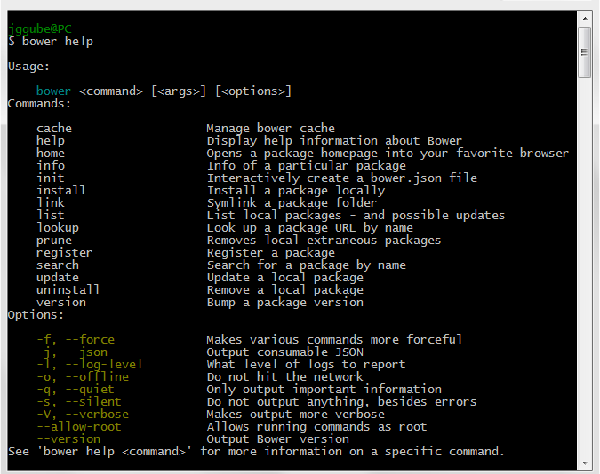
If you don’t have Node (and npm) installed yet, you might want to read this tutorial first: How to Install Node.js. If you don’t have Git either, check out our tutorial called How to Quickly Get Started with Git — it’s written by Tobias Günther (who knows a thing or two about Git, given that his company built one of the most popular Git graphical user interfaces in the market). Once you have Node, npm, and Git ready to go, install Bower by running the following command in your command prompt/terminal: The command above installs Bower globally, which means it will be accessible anywhere in your computer. Just a funny aside, the command above is similar to using Mozilla Firefox to download Google Chrome. Anyways, moving on. Next, navigate to your project’s directory/folder. This is important — and I want to say this early on in this tutorial — because the rest of the tutorial assumes you’re already in your project’s directory. If you don’t have one, just create a folder somewhere in your computer, name it something like “bower-tutorial” or “messing-around-with-bower” or whatever, and then navigate to it. You don’t want to be doing all of this in your Desktop folder or something. Getting HelpSince this is probably your first time using Bower, the command I’d like to talk about first is the Issuing the
If you want to learn about a particular Bower command, there are two ways to go about it. The first is to issue the
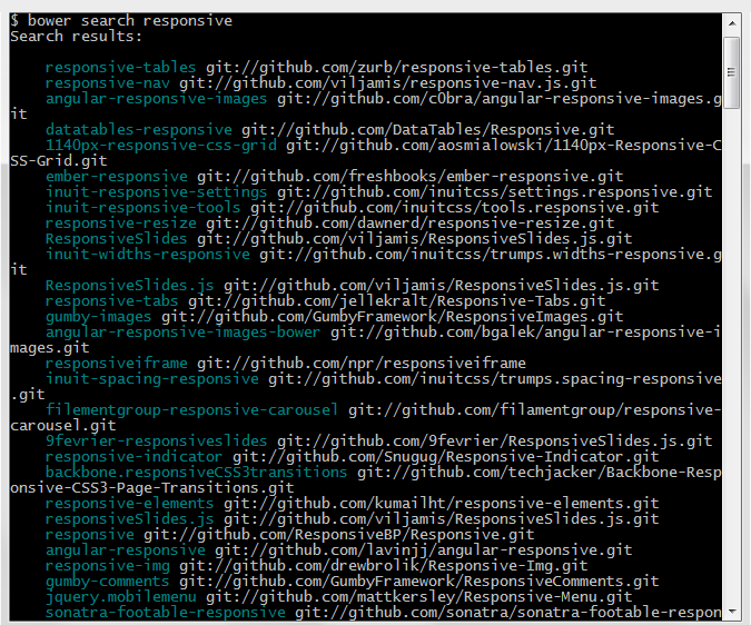
The other method is to type the command followed with the The following is exactly the same as By the way, Bower command options will often have shortened versions to make them easier to type. For example, the Find Bower Packages to InstallTo locate Bower packages you might want to install, you can use the For example, if we’d like to look for packages tagged with the keyword “responsive”, we can issue this command:
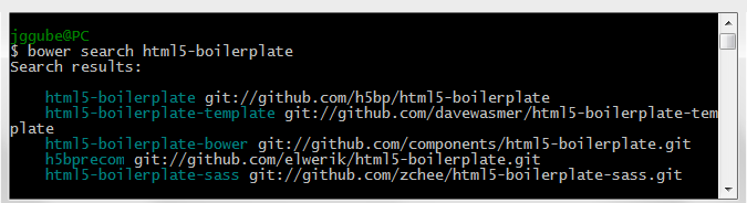
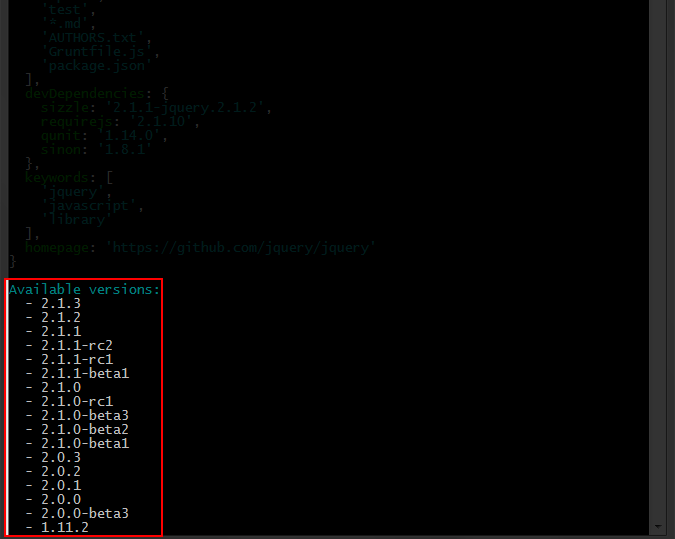
If you already know the name of the project you want to install and want to see if it’s available as a Bower package, you can type its name instead. The package name is equal to the project’s GitHub repository name. For instance, if we’re interested in seeing if HTML5 Boilerplate has a Bower package, and we know that the project’s name is “html5-boilerplate”, we can type: The command will return all the Bower packages that match the package name you’ve entered.
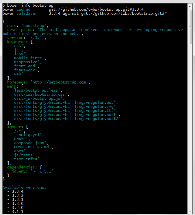
If you’d rather use a web interface, you can hit up Bower’s search page. Get Information on a PackageIn the above example, you can see that Bower returned several results when we did our Let’s output some information on Bootstrap. The command will display the contents of the
Installing Bower PackagesThe main way to get Bower packages into your project is through the Let’s grab the jQuery package. We can do so using this command: The command will get the latest version of jQuery. Installing a Specific VersionBy default the Perhaps you’re feeling a bit adventurous, and would like to use a not-yet-stable release candidate version, or maybe you want to use an older version that’s compatible with an old project you’re working on, or you’re doing some sort of backwards-compatibility testing. To do this, we just need to specify the version number, preceded by a hash ( I recommend issuing the Doing
If we wanted to install an old version, like version 1.11 for example, then this is the command we’d use: Setting Up Your Own Bower PackageA lot of us use the same set of dependencies in our development projects. And some of us even have multiple sets of dependencies, like one set for our personal projects and another set for work-related projects. You may have found yourself always using the same third-party dependencies — Sass to write CSS, Angular for front-end functionality, HTML5shiv to support old browsers, etc. — throughout your different development projects. It would therefore be more efficient and manageable to set up a sort of template for your dependencies. We can do this by creating our own custom Bower package. This is done by creating a manifest file called You can create Issuing the
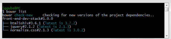
If you already have other Bower packages installed prior to running the Next, we will include other packages to our own Bower package by specifying them as dependencies. We do this by issuing the Let’s set up the package to include jQuery, Normalize.css, and HTML5shiv. Note: For developer tools such as code linters, CSS compressors, and unit tests — i.e. packages that are only used during development — use the Now whenever you want to install your packages in another web development project, just use the Bower If you would like to configure your Useful Bower CommandsHere are a few other basic commands that will surely help. (To see all the Bower commands, go to Bower’s list of commands.) See All of Your Bower PackagesIf you’ve stepped away too long from a dev project — let’s say you’re doing maintenance or redesign work for a client a couple of years down the line — a useful command that will remind you which packages you used in the project is the What’s great about this command is Bower will also check to see if there are new versions of your packages available. Below, you can see that there are new versions of the packages I’m using:
Updating Your PackagesIt’s crucial to, at the bare minimum, update your third-party dependencies whenever there’s a security patch. Doing this manually across all of your dev projects (to put it mildly) is quite time-consuming, tedious, and error-prone. But with Bower, all you need to do is issue the To update a specific package, just use the Using the Uninstall Bower PackagesIf you want to remove a package, just use the Uninstall DependenciesIf you want to remove a package from your ConclusionIn this tutorial, we covered the basics of Bower. This tutorial covered the following:
In other tutorials, we’ll be exploring intermediate and advanced Bower features such customizing your Bower configuration and Bower’s Programmatic API. Related Content
The post Bower Beginner’s Guide appeared first on Six Revisions. | ||||||||||||||||
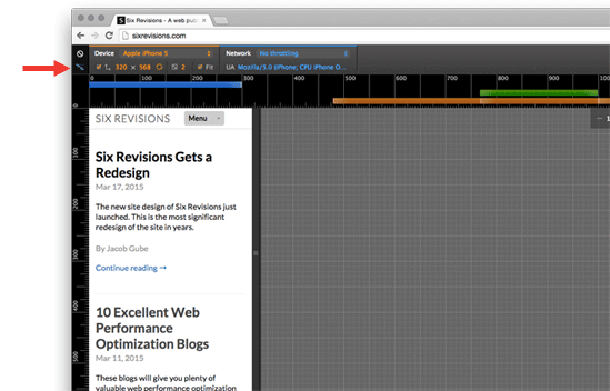
| How to Test Responsive Designs Posted: 18 Mar 2015 07:00 AM PDT Testing your responsive web designs is crucial because the user experience on mobile devices is quite different from desktops. But actual testing on all the mobile devices in the market isn’t practical for most of us. So a simple responsive design testing technique some of us do is resizing our browser’s window size to kind of match the viewport sizes of smartphones and tablets. This is a quick-and-dirty trick for basic visual testing and it help us spot major problems, but it’s a terribly inaccurate portrayal of the mobile device experience. Mobile devices have unique touch interactions like swipes and pinch-to-zooms, and likewise desktops have interactions like hovering and right-clicking. Responsive designs must account for these variances. This tutorial will discuss an effective and practical method for debugging and testing your responsive designs. It involves a tool you probably already have: Google Chrome. Google Chrome’s DevTools has a feature called device mode that’s loaded with helpful tools for testing and debugging responsive designs. Device mode is unprecedented. Most other responsive design testing tools simply resize your viewport, but device mode actually emulates the mobile device experience, particularly touchscreen interactions like tapping and swiping, right in your web browser. Here’s a run down of device mode’s main features:
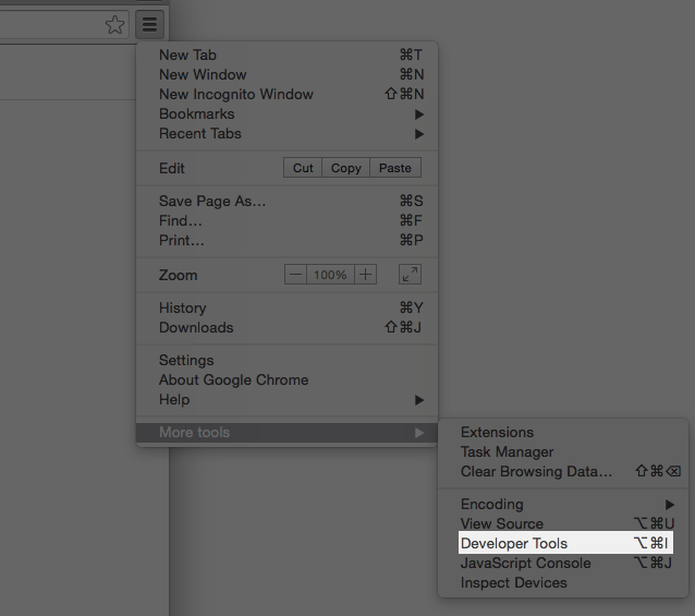
To start using device mode, open up your web design in Google Chrome. Then, open Developer Tools by clicking on Chrome’s menu and then choosing More tools > Developer Tools. The keyboard shortcut for opening Developer Tools is Ctrl+Shift+I (Win) or Option+Command+I (Mac).
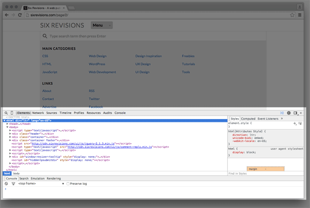
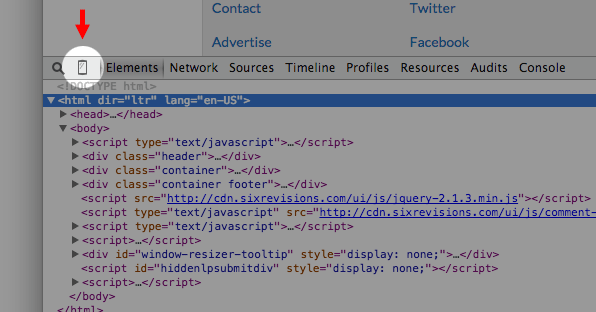
You should now see the Chrome Developer Tools (abbreviated as DevTools from now on) panel at the bottom or on the right of your browser’s viewport.
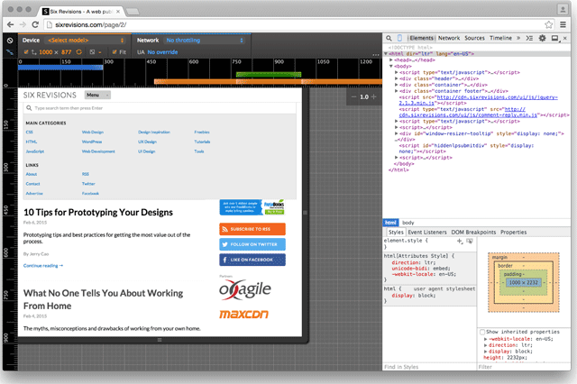
Click on the device mode icon (it’s a super tiny button that looks like a smartphone) to toggle device mode on and off.
When device mode is turned on, you’ll see something along the lines of the image below, and the smartphone icon will turn blue:
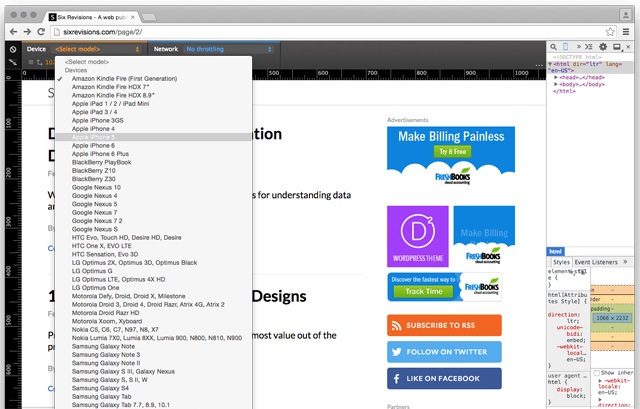
Responsive Design Testing on a Specific Mobile DeviceUse the Device panel to emulate the experience of a particular mobile device. This will allow you to visually test your design on said mobile device, as well as test touch-like interactions.
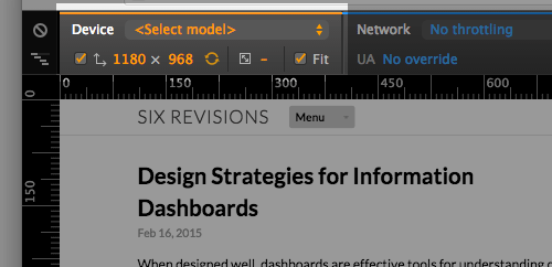
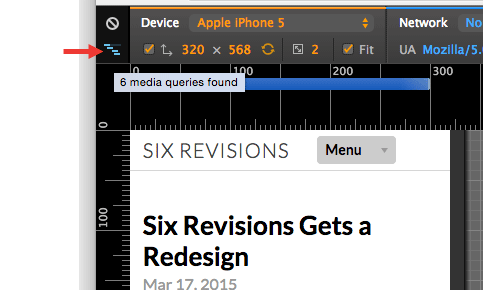
Let’s say we’d like to see how our responsive design looks and functions on an iPhone 5. All we’ll need to do is select that device in the <Select model> dropdown list:
Device mode will change the design preview so that you’re seeing what an iPhone 5 user might see. What’s more, if you notice, your mouse cursor is now a circle. When you move your mouse up and down, the design preview will scroll up and down, simulating the swipe interaction behavior. Moving your cursor over a link won’t act like you’re hovering over it (because there’s no hover on touchscreens).
Media Queries Testing/DebuggingDebugging and testing your media query breakpoints is super easy when you’re using device mode. Just click on the the “waterfall” icon at the top-left of device mode and it will show you a bar graph of your breakpoints.
Also, hovering over the “waterfall” icon will display the number of media queries there are on the page you’re testing.
Clicking on the bars will immediately switch the design preview to that media query breakpoint. Switching back and forth between your media queries is quick, making this feature quite a huge time-saver.
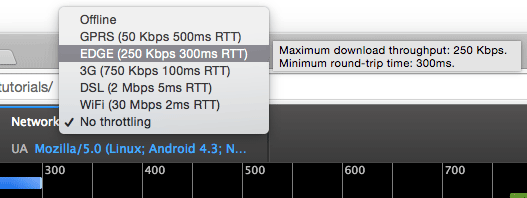
The colors of the media query bars are indicative of the type of media query being represented: Orange is a min-width media query, blue is a max-width media query, and green is a min and max range media query (e.g. Related article: Design-Based Media Queries Mobile Internet TestingYou can test the perceived performance of your responsive design by using the Network feature of device mode. Click the Network dropdown menu and choose the mobile network technology you want to test with, such as EDGE or 3G. This feature will throttle your Internet connection to match your chosen network technology.
ConclusionDevTools is an incredibly powerful tool, and device mode makes it an even more indispensable part of the modern web designer’s toolkit. There are a few more features in the device mode for you to explore, such as:
Share your strategies for responsive design testing in the comments below. Do you have tips to share about device mode? Related Content
The post How to Test Responsive Designs appeared first on Six Revisions. | ||||||||||||||||
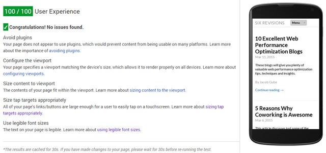
| Posted: 17 Mar 2015 01:07 AM PDT The new site design of Six Revisions was launched a few hours ago (officially named Six Revisions version 2). This is the most significant redesign of the site in years. The main objective of this new design is to improve your reading and overall experience on the site. HighlightsThere’s still quite a lot of design, web performance, and functionality issues to resolve, but overall this redesign should greatly enhance your experience on Six Revisions. I’ll briefly walk you through some of the design improvements in the new version. Responsive DesignSix Revisions readers accessing the site with their mobile device will be pleased to know that the site now provides them a much better reading experience. A quick check on Google PageSpeed Insights shows no issues with mobile UX. (However, I still need to work on mobile and desktop page speed improvements across the site, as well as enhancements beyond PageSpeed Insights suggestions.)
Dealing with the embedded code samples (content wrapped in Improved ReadabilityThe old web design was aesthetically outdated. It was clunky. It was broken in so many areas and in so many ways. Most importantly, it got in the way of your reading experience on the site. The new design is optimized to present Six Revisions content in the best way possible, so that the hard work of our authors is no longer being overshadowed by UX, usability, and readability problems created by the previous design. The new UI is clean and simple, and is designed with the intent of complementing your reading experience, rather than being a focal point. Improving readability, among other things, involved significant time and effort given to designing, evaluating, and testing the design’s typography. The primary web font used in Six Revisions version 2 is Lato, an extremely legible and pleasant-to-read font designed by Lukasz Dziedzic. It comes in 18 variants and has 3,000 glyphs, making it a flexible and robust font that can handle old, current, and future Six Revisions content.
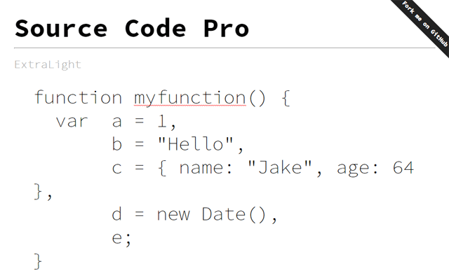
Code samples are an essential component of a publication that caters to professional developers and web designers. The font used to present embedded code samples is one of my most favorite programming fonts, Source Code Pro. It works well with the main body font, and it’s simply gorgeous. It’s exceptionally legible, and makes reading code a more delightful experience.
The site’s typography still needs to be perfected and fine-tuned, so this area is a work in progress. Improved Site NavigabilityOne major issue with the old UI was it was tough to navigate to content that you might be interested in. One feature aimed at improving site navigability is the fixed navigation bar on top of our web pages. This allows you to move throughout the site easily without having to scroll back up to the top of the page. Scrolling back to the top of the page to navigate the site was particularly troublesome in the old design, since Six Revisions publishes long-form articles. In the future, this navigation bar will display contextual navigation items and information based on where you are on the site to help you discover other articles and tutorials you might be interested in. I’m in the process of building more interfaces that will make our body of content easier to navigate. For instance, I’m currently developing an interface that makes it manageable to view 50 to 100 Six Revisions articles on a single web page to reduce the amount of time and effort required to transition to another page. A critical issue right now is that the site search feature is not displaying search results. This is a high-priority bug that I will work on in the next few hours (after I get some sleep). Better UX for DiscussionsOne of my main goals is to improve your ability to interact with other members of the Six Revisions community. One of the first steps I took towards this goal was to enable multi-level commenting so that we can all have better conversations in the comments. My desire is for Six Revisions to become a venue where people from all over the world interested in development and design come together to talk about the subject we’re passionate about. I’ll be introducing a feature that allows you (and other people on Six Revisions) to view your comment history on the site. Another feature I’m thinking about implementing is social voting in the comments section so that the community gets to decide which comments other readers should pay attention to. Also, I’ll be developing ways to encourage readers to contribute to the discussions by giving people who regularly share important information and engage in meaningful conversations special avatars, one-on-ones, and so forth. For now, Gravatar support has been disabled due to web performance concerns. I’m reviewing our options for better avatar support in the comments. RoadmapI want to talk about some things you can expect on this site from here on out. I have a million things I want to share with you regarding the future of Six Revisions, and I can’t fit them all into this post, so I’ll be discussing them in more detail in subsequent posts. VisionMy mission is for Six Revisions to be a leading source of information on development and design, a place where you go to learn and stay updated on essential topics related to building sites and apps. Main TopicsThese are the core topics that we’ll be covering in the form of tutorials, articles, guides, and other forms of content:
Other subjects that matter to developers and designers will also occasionally be covered. These include project and business management, content strategy, SEO, and general design and code theory. Content ImprovementsThe most critical area of concern is the site’s content. Six Revisions hasn’t been publishing articles regularly, and I need to address that right away. These are some things I’d like to improve on: Improve publication scheduleRight now, Six Revisions publishes between one to three articles per week. The first step is to work towards consistently publishing three articles per week (Monday, Wednesday, and Friday). The next objective will be to publish 5 articles a week (M-F). After that, Six Revisions will start to post at least one article a day. Improvements in the authoring experienceThe writing process and incentives for our authors need to be improved. The task of contributing articles to the publication must be streamlined and made easier in order for Six Revisions to be able to publish high-quality articles regularly. If you’re interested in writing tutorials and articles to be published on Six Revisions, please email me at jacob@sixrevisions.com. Content archive maintenanceWe’ve published over a thousand articles. A lot of them are timeless. However, many are also outdated because that’s just the nature of development and design, things change so much and so frequently. I’ll develop methods that will keep our content up-to-date as much as possible: Facts that are no longer true must be corrected, broken links and other issues will be addressed. Community Engagement and TransparencyWithout you, there would be no Six Revisions. I will create more engagement opportunities, whether that’s in the form of introducing new discussion features on the site, or simply just having more regular conversations with you in the comments section, social media, and/or email. Also, I’ll keep you updated with the things that happen behind the scenes. For example, I’ll start posting quarterly reports to give you a status update on Six Revisions. DesignRight now, there’s still a lot of UI-related issues with the Six Revisions version 2 design. For example, you’ll see some "jankness" when you view the site on iOS devices, and possibly in other devices that I haven’t gotten the opportunity to test with yet (outside of emulators). I will fix these throughout the week. If I may ask you a favor: Please leave a comment below (or email me) if you spot any issues with the design. Thank you so much. Other things I’d like to do with the design of the site:
CodeIn terms of front-end development, these things still need to be done:
Wrapping UpI look forward to your feedback about Six Revisions version 2. I know many of you have been waiting for a better UI and UX on the site. I’d like to hear your thoughts on the future of Six Revisions. Do you have ideas for improving Six Revisions? What subjects should we cover on the site? Also, I want to thank you for your continual support of Six Revisions. About the Author
The post Six Revisions Gets a Redesign appeared first on Six Revisions. |


| You are subscribed to email updates from Six Revisions To stop receiving these emails, you may unsubscribe now. | Email delivery powered by Google |
| Google Inc., 1600 Amphitheatre Parkway, Mountain View, CA 94043, United States | |
No comments:
Post a Comment