Modern sites and apps rely heavily on open source projects such as JavaScript frameworks (jQuery, Angular), UI frameworks (Bootstrap, Foundation), content management platforms (WordPress, Drupal), CSS preprocessors, and then package managers (Bower, npm) to keep track of them all.
Let’s talk about our favorite open source tools for building sites and apps.
Some potential talking points:
What open source tools have you begun to use just recently? Why?
Tell us a story about how an open source project saved the day. (Perhaps helping you meet a deadline, or helping you do something that seemed impossible.)
If you could have just one open source tool, what would it be and why?
The floor is yours!
This open thread will be open until April 8, 2015 (Wednesday).
By the way, you can use these HTML tags to format your comments:
Text link:<a href="">Link</a>
Image:<img src="" />
Bold:<strong>Bold</strong>
Italics:<em>Italics</em>
Lists:<ul><li>List item</li></ul>
HTML code:<code><HTML></code> has to be escaped to display properly.
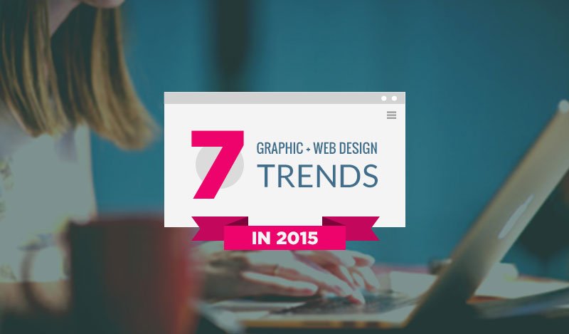
We’re finishing up the first quarter of 2015 and have seen many predictions for the web design scene already.
While most of these predictions make a lot of sense based on what we have seen being used lately, I’d like to dig deeper into these trends and analyze the top 7 web design trends while providing some tools and resources in achieving the desired look.
What trends you need to watch out for this year?
Find Out In This Article If You Know The Latest Web Design Trends of 2015
For every trend, I will provide you some data and research that supports the fact followed with examples of real websites utilizing it. I will also recommend some tools, resources and services for implementing the trend into your project.
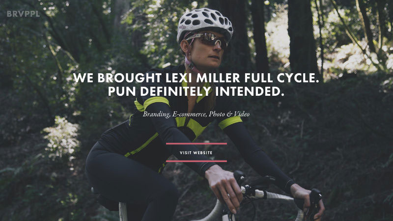
Brave People uses a slideshow of full-width genuine photo backgrounds that create an impression of a humanistic brand.
1. Imagery Web Design Trend: Large Background Images
Stock photos still play a major role in digital communication, whether it’s an eCommerce store, portfolio or blog. People use images to engage more with users and illustrate the message they are trying to send. For a long time, the web has been suffering from cheesy and fake looking stock photography with super happy people wearing perfect smiles and suits.
Thanks to communities, like Unsplash, Picjumbo, Death to the Stock Photo because designers now can utilize beautiful and, most importantly, natural looking photos for their web designs or blog posts. We’ve seen many websites using photos from Unsplash and it simply looks amazing.
“Users pay close attention to photos and other images that contain relevant information but ignore fluffy pictures used to “jazz up” Web pages.” – Nielsen Norman Group
The Nielsen Norman Group eyetracking studies have shown that people generally ignore cheesy and artificial looking photos. However, 2015 is the year of genuine imagery and you should take advantage of using real photos to connect with your audience in a genuine way.
Examples of Large Background Images in WebDesign
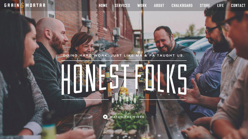
Grain & Mortar is another great example of beautiful imagery in web design.
Natural and real photography resonates with people, instead of using cheesy stock photos. Grain & Mortar used an informal shot of their team that connects with the visitors very well.
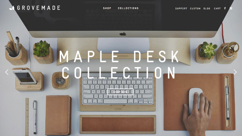
Grovemade has a beautiful, product-focused approach when it comes to their website.
People make purchases based on their emotions. Grovemade utilizes high-quality photos of their products that definitely add a feeling of trustworthy organization and awakens a desire to buy the product.
Free Stock Photo Websites:
Unsplash is a great place for getting great looking photos of various objects including people, technology, nature, and more. You can use photos for personal or commercial purposes without any attribution.
Raumrot is a collection of free handpicked stock photos for your commercial and personal works.
Gratisography provides free beautiful high quality photos with a creative spin for your personal and commercial projects.
Life of Pix has a huge variety of natural looking stock photos that are free to use for any project without any attribution.
Death to the Stock Photo is an exclusive membership that sends free stock photos that you can use any way you wish to your inbox once a month .
Picjumbo is an ever-growing collection of free stock photos that don’t require attribution.
Jay Mantri exceptional quality stock photos that you can use for free for both personal and commercial projects.
Premium Stock Photo Websites:
Stocksy offers a tightly curated collection of high-quality stock photos to anyone seeking modern, relevant, authentic images.
500px Prime provides super exclusive stock photos. Most of the photos on 500px Prime have never been used in commercial campaigns before.
Refe focuses on providing high-quality imagery of people interacting with technology for your projects.
Snapwire connects mobile photographers with businesses and brands that need creative imagery. They also have a huge database of stock photos.
Offset is a truly unique collection of images from award-winning artists.
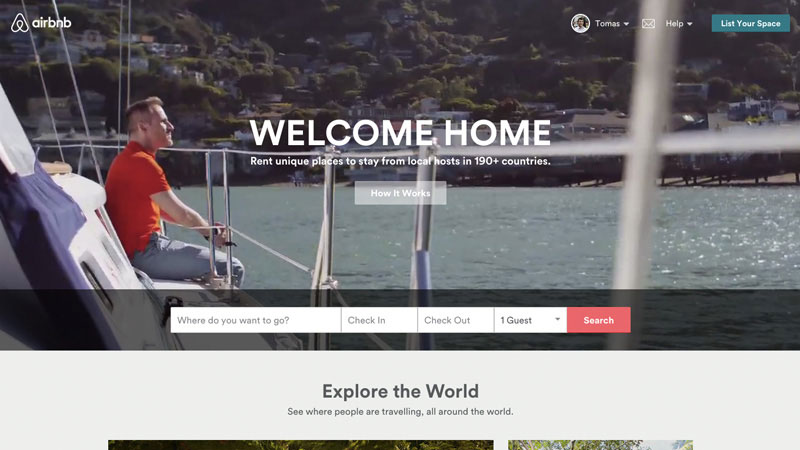
Airbnb takes advantage of beautiful videos in order to complement their ‘Belong Anywhere’ campaign.
2. Video Background WebDesign Trend
Websites generally are storytelling tools and storytelling can be more effective when visuals and motion are involved so the ideas and emotions can be transferred to the visitor easier. We’ve seen businesses implementing video in their websites. In 2015, this trend will grow even more with the endless possibilities of 3D graphics and HD quality videos to build that impression of real life experience.
According to ClickZ people love video as statistics show mind blowing numbers of video consumption online.
Users prefer content in a visual format, which explains why online content video views have finally topped 50 billion views each month.
The exponential growth of YouTube proves the fact that old school TV is dying and people prefer to choose what they want to see. SocialTimes infographic reveals surprising numbers of how US millennials are abandoning TV.
YouTube reaches more US adults aged 18–34 than any cable network. Users upload 100 hours of video to YouTube every minute.
The downside of this trend, however, is extended load time. Many websites solve this problem by beautifully designed loading screens but it doesn’t change the fact that people still have to wait for the full experience to load.
Examples of Video Backgrounds in Websites
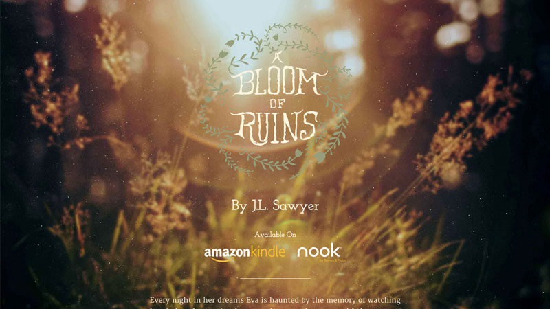
A Bloom of Ruins is a great example of subtle video being used as a full website background.
A Bloom of Ruins creates a memorable experience by utilizing mysterious light and blurred imagery in the video background and loads super fast making a magical overall look and feel.
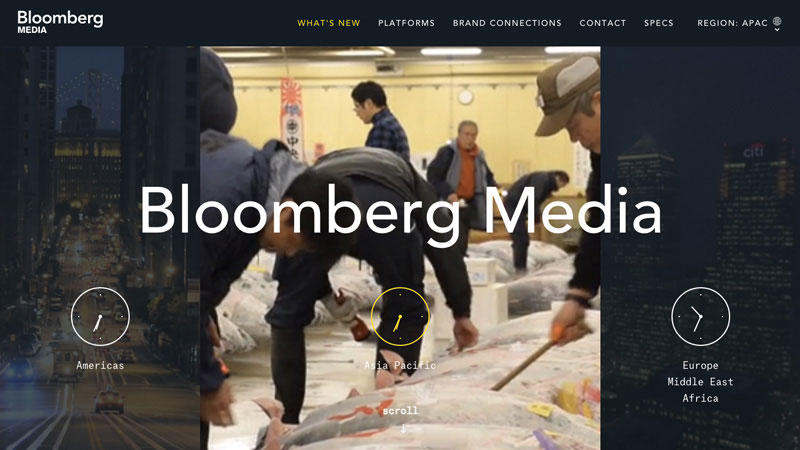
Bloomberg Media uses video to demonstrate the diversity and capabilities of their work.
Bloomberg Media is a media company whose focus is large amounts of information and breaking news. Utilizing video that is activated by hovering your mouse over add this feeling of being a trustworthy and technology savvy company.
3. Personal Branding Trend In WebDesign
Personal branding exists whether you focus on it or not. Your identity and your image (how you are perceived by other people) are very different. The main focus of personal branding is to align vision and mission so you are perceived as you’d like to be instead of people speculating and having different opinions about you.
“Your brand is what people say about you when you’re not in the room” – Jeff Bezos, Founder of Amazon
I highly recommend you check Neil Patel’s “The Complete Guide to Building Your Personal Brand” to better understand the importance of personal branding and actionable steps to get where you want to be.
Examples of Personal Branding in Websites
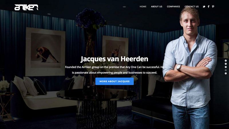
An1ken Group website isn’t yet another faceless organization. Nicely used profile photo and a simple description says it all.
Founder of An1ken, Jacques van Heerden makes sure people get to know him, his company values and what his company is all about. No hiding online – visit the website now and tell me does this company look and sound trustworthy to you? It totally does for me.
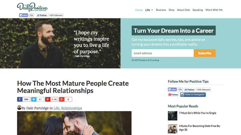
The Daily Positive is highly associated with Dale Partridge personality.
Having a human behind the brand or organization makes people trust it and help them make a decisions easier. Personal photo along with a combination of high number of followers as a social proof ensures people that it is worth following.
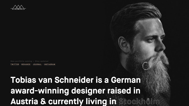
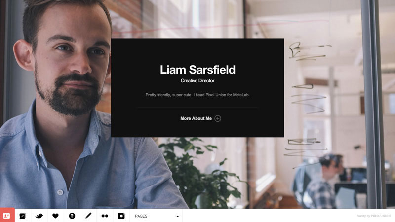
Tobias van Schneider has a very memorable portrait photo accompanied with bold typography and straightforward facts.
Bold, straightforward and effective. Tobias uses lots of negative space to draw attention to his personal brand and make communication clear with concise facts.
WordPress Themes Focused On Personal Branding
When designing a personal brand focused website consider including your vision or mission statement. Use personal photos, add some credibility, such as list press, interviews, published content, and achievements.
Rosemary is a light & bright blog theme, tailored to showcase your content in an effortlessly timeless style.
Rosemary is a perfect blog theme for anyone willing to build a personal following. It has a clean, content-focused layout and specific widget designed to sell yourself by using your profile photo, description and all the social networks you are in.
Readme is a responsive WordPress theme focused on readability with a minimalist design and optimized for mobile.
A trendy and minimalistic blog theme with a strong focus on the author, this theme offers a designated area for your photo, short elevator pitch, and call to action button.
Vanity is a recasting of the business card. Made with creative professionals in mind.
People are interested in other people. People buy from people, not from companies. This theme has been designed to help you make that human connection with other people so you can brand yourself better.
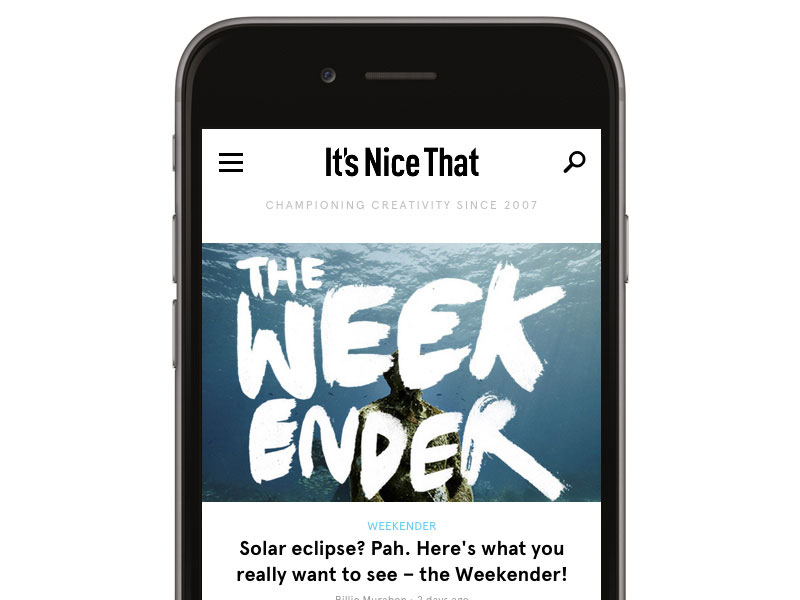
It’s Nice That combines beautiful visuals and elegant typography to build a pleasant mobile reading experience.
4. Web Design Trend – Mobile First Websites
Web usage patterns are changing and statistics cannot be ignored if you want to succeed in today’s market. Every third website visitor now uses a mobile device and websites that do not offer mobile optimised versions are causing an unpleasant experience and eventually losses money as users tend to abandon the website if it doesn’t render well on mobile device.
“The number of people using mobile devices outstripped people on desktop computers in 2014.” – Jim Edwards, Business Insider, April 2014
Adopt a mobile first approach when designing or redesigning your website to ensure that you maximize your potential and reach more of your target audience. This means you have to be brief, focused on the content and performance which takes advantage of advanced features, like mobility, GPS, touch screen and more, that desktops aren’t able to offer. In 2015, we’ll be seeing the continuous growth of mobile web design development and spectacular innovations based on the ever changing market behavior.
Read more about Mobile First, an adaptive, future-friendly solution for website design.
Examples of Websites Built Mobile First
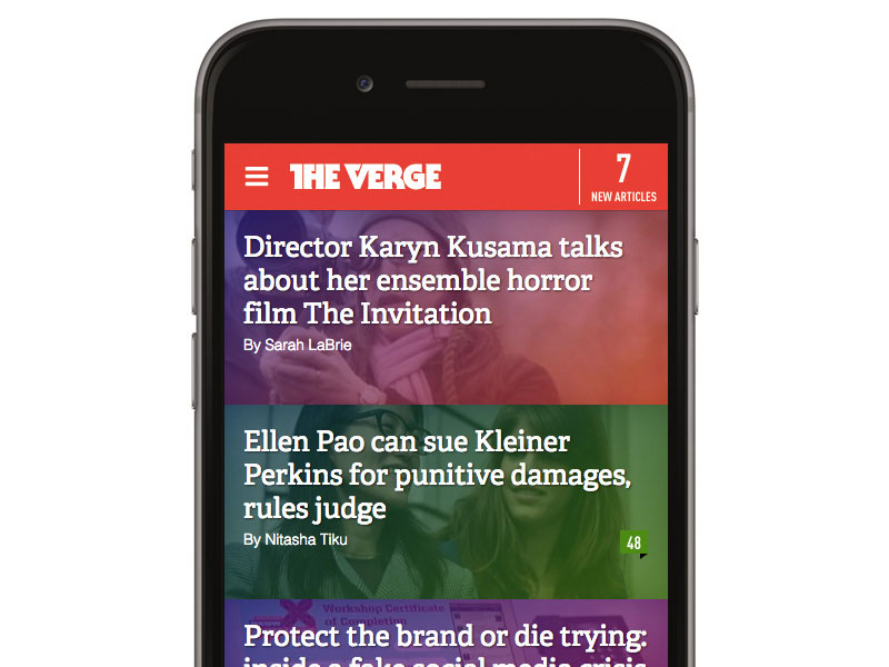
The Verge is a perfect example of tapable space and finger friendly buttons, (read post titles with illustrations).
The Verge is a super visually heavy news website with lots of colors and imagery. However, they have done a great job on optimizing it for mobile devices with a clean layout and close relation to the desktop version.
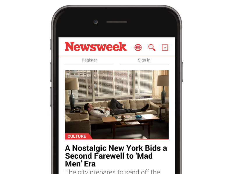
Newsweek is a great example of heavy content website that looks organised and lightweight on mobile device.
Keep it simple is the design approach the Newsweek design team has taken to form their mobile version with loads of white space and clean typography and accompanied by relevant imagery.
Responsive and Mobile Friendly WordPress Themes
The responsive or mobile-friendly version of your website can easily double your traffic as people will be empowered to access your website any time anywhere. The themes below are suitable for various projects and are responsive already.
BeTheme is a responsive template with nice imagery and clean flat design.
In 2015, responsive is a must, not just a nice to have. The BeTheme is an extremely advanced, customizable and responsive WordPress theme with built-in drag & drop tool that gives unlimited possibilities.
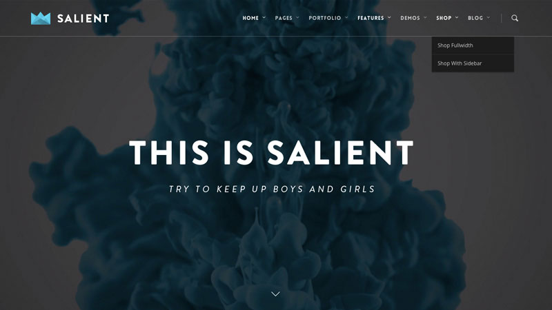
Salient delivers great graphics and sleek look and feel on any screen size.
When designing a content heavy website you always need to take care of how mobile devices will display it. Salient is a responsive and retina ready WordPress theme with unlimited customizing possibilities that will look stunning on any type of device.
Blocks looks great on both, desktop and mobile devices.
Most of app websites don’t require multiple pages to sell the idea. The Blocks iPhone App Website Template is a responsive 1 Page iPhone App HTML website template which looks great and is super easy to update and use.
A lot of white space combined with strict grid and rectangle shaped content blocks look very balanced and trustworthy.
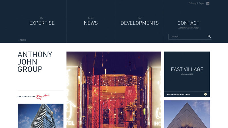
5. Modular Design (Grid Based) WebDesign Trend
Modular or grid based design, also known as cards/tiles design approach, is not new in the web design scene, but it started to get more traction as it is reusable and very responsive-friendly with the tiles stack nicely on different screens and form a flexible layout that looks nice and clean on any screen size.
Modular design, or “modularity in design”, is a design approach that subdivides a system into smaller parts called modules or skids, that can be independently created and then used in different systems. A modular system can be characterized by functional partitioning into discrete scalable, reusable modules, rigorous use of well-defined modular interfaces, and making use of industry standards for interfaces. – Wikipedia
One of the best known examples of modular design is the Microsoft Metro style which doesn’t seem to be very successful, though. However, many web apps like Pinterest, Instagram, Designspiration are utilizing the grid based design very successfully.
Website Examples of Modular Design WebDesign Trend
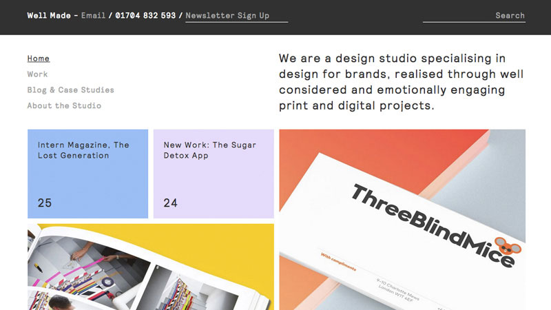
A nice and clean example of how tiles are used to lay down the content of the website.
Well Made Studio has a harmonious combination of pastel color palette with authentic typeface and balanced spacing.
Grid Based WordPress Themes
Grids are great for displaying galleries but also can work well with written or multimedia content. Themes below have unique and creative take on grid based layout.
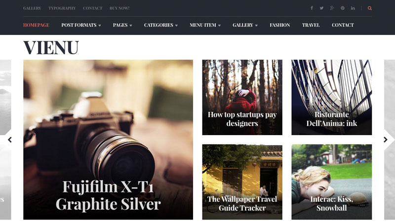
Vienu is a nicely designed magazine theme with beautifully executed modular design approach in mind.
It is hard to find a visually appealing magazine theme as they are always overloaded with information, Vienu, however, has a balance between tiles and list blocks that simply work together creating a pleasant experience.
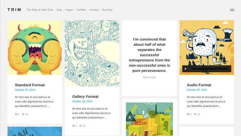
Trim is a notably sleek and tidy WordPress blog and portfolio theme built using grid.
Trim is an elegant theme that utilizes grid layout in a very artistic and visually appealing way. Whether you have an image based post or just text, you are covered. Everything you publish on this theme will look great.
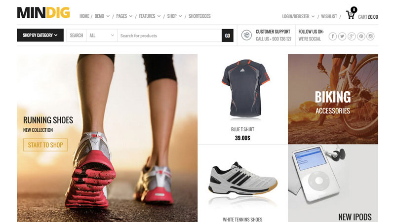
Mindig is a flat & multipurpose eCommerce theme for WordPress that utilizes the modular design approach.
When building an e-commerce store you should think of ways to lay your products in a way that appeal to your potential customers. Mindig has a nice grid based layout with a professional use of white space and powerful typography.
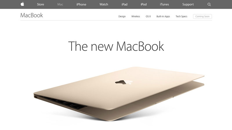
Apple MacBook has designed a super long single page to represent its new product emphasizing beautiful shots of the product accompanied with smart copy. The goal is simple, convince user to buy by the end of the page.
6. One Page (Single Page) Web Design Trend
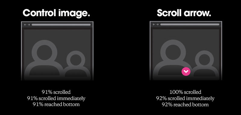
It simply makes more sense from the UX perspective – Rebecca Gordon’s research “Everybody Scrolls” shows that users love scrolling.
Research conducted by Huge shows that despite the layout structure nearly 90% of visitors will scroll until the bottom.
Scrolling is winning over clicking due to the changing web browsing patterns. As mentioned earlier, mobile device usage growth has influenced the way websites are designed nowadays. With smaller screens and super natural touch scrolling movement, people prefer to scroll around instead of clicking on the links and waiting for the content to appear.
One pagers gained momentum a couple of years ago but now it has started to make even more sense and people seem to enjoy it as it presents huge chunks of information at once in a nicely designed step by step flow.
Examples of Single Page Websites
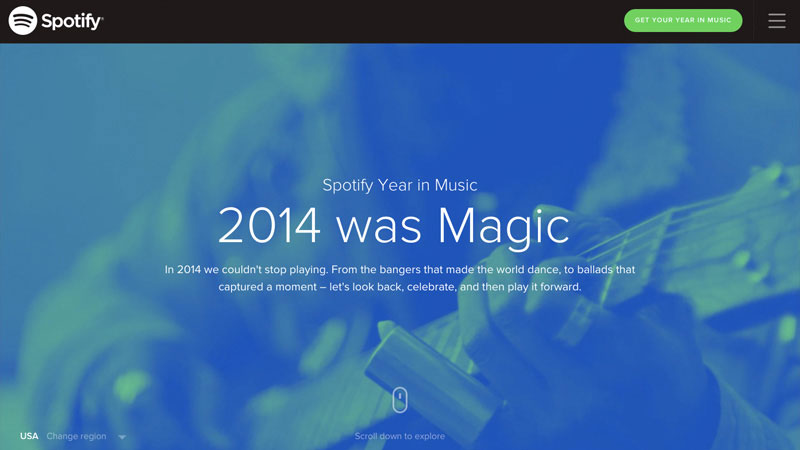
Spotify’s Year in Music allows a natural timeline of the year in an easy to browse manner.
One page layouts are popular among yearly reviews like Spotify’s Year in Music. Large amounts of data and statistics digested for mass consumption with a visual and interactive approach.
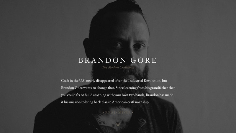
Great example of the previously discussed Personal Branding trend combined with One Page design philosophy.
One page design philosophy starts to get traction among individuals building personal portfolios, Brandon Gore being one of them. He includes a personal portrait photo to better connect with the visitor and provides some essential information about himself, his work, and his contact numbers.
One Page (Single Page) WordPress Themes
As you already know, people don’t mind scrolling but loading a lot of content in one page might take longer than splitting content to different pages. However, you expose your users more to all of your content at once.
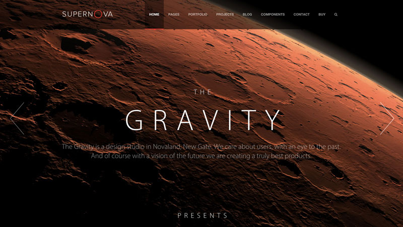
Supernova is a nicely designed layout that can be easily customized and used as an impressive one page website.
Supernova is a multi-purpose theme with innovative and state-of-art techniques and design features such as transparent menus and elements, parallax effects, motion backgrounds, and more.
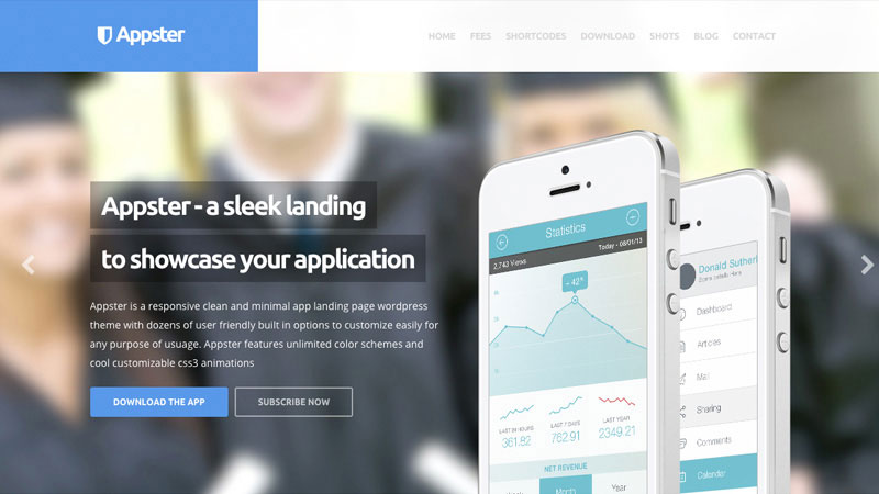
Appster is an elegant one page WordPress theme perfect for promoting your application.
With an ever-growing market of mobile apps, one page app websites prove to work and produce positive results, such as getting followers and downloads. Appster is a sleek one page website layout with a focus on your app.
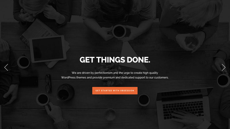
Obsession is a flexible and highly customizable multi & one page WordPress theme.
This theme has all the popular features a one-page website should have, a full-width slider with clean copy and clear call to action button and a customizable content area that delivers everything you may need on your website.
Strong focus on key brand color and loads of negative space with an emphasis on the product.
7. Material/Flat design Web Design Trend
Flat design was quickly adopted by designers and big tech companies like Apple that basically killed skeumorphism very quickly.
Some of the advantages of using the new paradigm are that flat design forces designers to focus more on content, pick the right colors to help users navigate through designs, and use white space with care.
68% [of web designers] think that flat web design will still be around five years from now.
The popularity of Google Material Design philosophy is being embraced by many designers and developers that lead to cleaner and more organized digital products which can be used without the users having to learn the complex curve. Research conducted by Usabilla shows that web designers are in favor of the flat design movement.
Examples of Flat Web Design Trend Websites
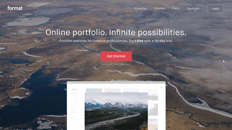
Format has a lovely combination of stunning image combined with sleek flat graphics in a balanced composition.
The main function of the flat design is to put emphasis on content while design has to serve as a communication tool. Format has mastered flat design by combining clean type with flat color scheme and stunning imagery.
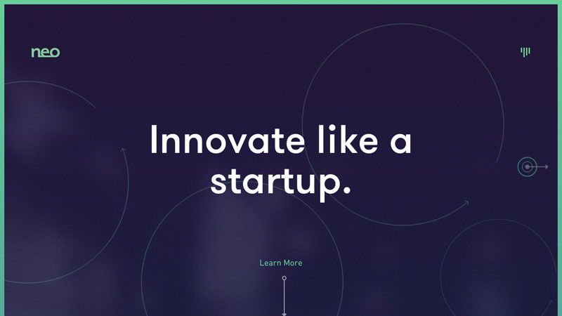
Flat design in action – clean layout with unusual color palette and loads of white space.
Neo has a balanced website design with dozens of negative space that makes reading very pleasurable. Also thanks to perfectly chosen typefaces. Flat design also works very well with minimal approach. for example, Neo delivers essential information with nothing to add or remove.
Flat Design Trend WordPress Themes & Templates
Flat design is extremely trendy these days and and I’ve mentioned the reasons why above. Themes below will get you on the trend train in no time.
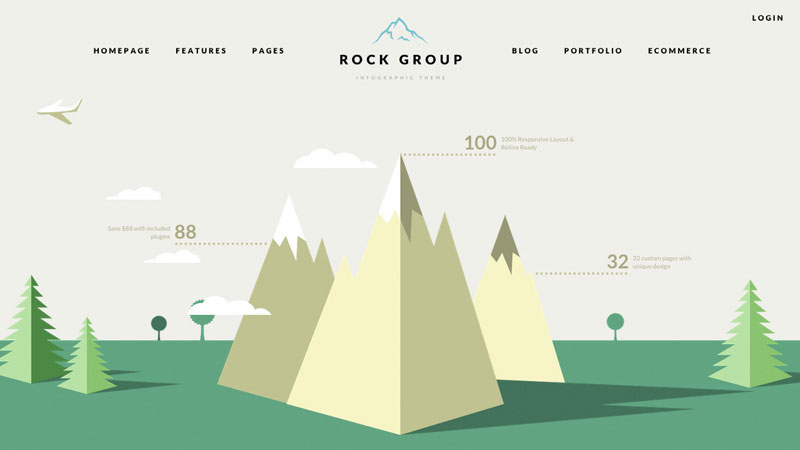
Rock Group is a unique and highly customizable flat design infographic style theme for WordPress.
Infographics generate 37.5% more backlinks than a standard blog post, says marketing expert Neil Patel. This theme is basically a huge interactive infographic that used with care can make wonders for your campaigns, not to mention the trendy flat look.
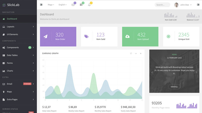
Beautifully designed and super clean flat admin dashboard template.
SlickLab admin dashboard template has a clean and clear structure with all potential widgets designed that any platform would require. White space, contrast, and typefaces all work very well together in this template.
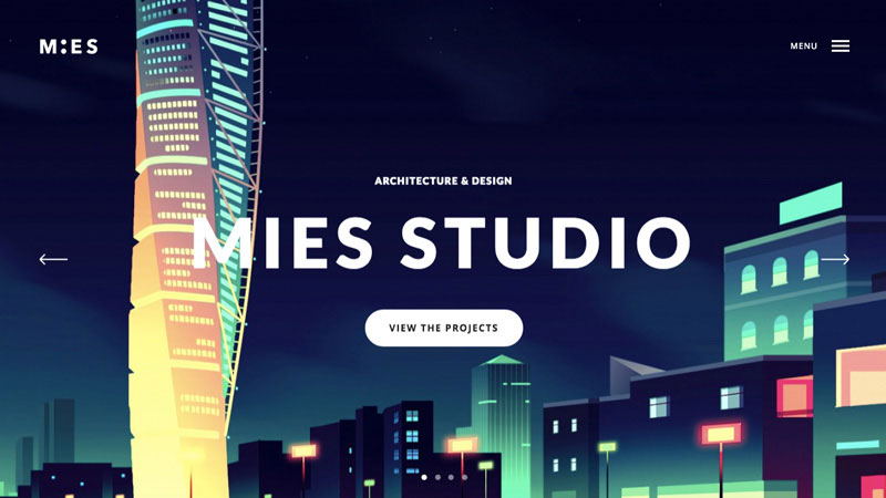
Mies is a very clean and simple flat WordPress theme perfect for creatives.
People are visual creatures – the more visual your storytelling is online, the better chances of you being remembered. Mies theme has a nice flat look and feel with oversized typography, obvious call to action buttons, and some sleek interactions.
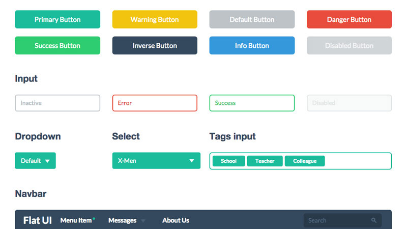
Flat UI Pro kit offers clean pre-designed elements for quick prototyping in trendy flat style.
Bootstrap based UI kit with loads of pre-designed elements from buttons to forms to various multimedia assets will save you a lot of time when prototyping or designing your website in a clean and trendy manner.
Summary and Conclusion About Web Design Trends in 2015
If you’ve been following the web design scene for some time you may have felt what is coming next. There are no significant changes in 2015 but some trends that started getting traction in 2014 will continue growing and affecting more people while others will slowly fade away. However, web design is evolving very quickly and, most importantly, it adapts to people’s behavior and technology advancements.
In this article I’ve touched some trends that will be on the spotlight for the rest of the year and the resources I’ve provided will help you to quickly get into the game.
What do you think is the next big thing in web design?
I’d like to give you an update on the things that have happened in the latest quarter (January 1 to March 31, 2015). Also, I want to tell you about some of the stuff I’ll be working on in the next few months.
This is my first quarterly report, so I’m just going to write this up off-the-cuff and iterate on the format in future quarterly reports.
OK, let’s go.
The biggest milestone this quarter was the launch of Six Revisions version 2. This redesign should’ve been launched much, much sooner. I’m still beating myself up for delaying this project for so long. It’s just not OK to have an outdated site design on a site that advocates modern web design and development practices. I won’t let that happen again. Moving forward, site design and functionality will have a much higher priority.
We published 26 posts this quarter, that’s +62.5% more content compared to the previous quarter (Q4 2014). My core focus in the next quarter (and probably the rest of the year) is to continue increasing the amount of content we publish, without sacrificing quality.
Here are the latest articles from our long-time authors:
Aaron White, UX developer at Formstack, a U.S. Army veteran, and cofounder of Cowork Btown, talked about why you should seriously consider joining a coworking space.
Joshua Johnson is a designer, photographer, editor, and writer. He currently works at Creative Market as a marketing manager. He was also an editor at Design Shack, a very popular design gallery. He’s managed to do all those things from the comforts of his home, and shares the things he’s learned after years of working from home.
Tobias Günther is the CEO and founder of fournova, the developers of Tower, the hugely popular Git desktop app. For the handful of us who aren’t sold on Git yet, he outlines some great reasons for using Git in his latest article.
We also welcomed 8 new authors this quarter:
Jerry Cao is a UX content strategist at UXPin, and his interests are content design and IA. He talked about the different types of design mockup fidelities and his design prototyping tips.
Kumar Sanket is a freelance full stack developer who works with Angular, HTML, CSS, PHP, and Node. He talked about his reasons for ditching Angular for React (the most popular article this quarter).
Woody Hayday is a multi-talented science-fiction novelist, web developer, and entrepreneur. He runs UK-based web/app development company, StormGate. WordPress plugin development is one of his areas of expertise. He shares some tips for WordPress plugin development based on his experience launching some successful WP plugins. He told me that his next article will probably be after he finishes his current sci-fi novel.
Sreeram Sreenivasan is the founder of Ubiq, a web-based reporting tool. He’s also a web developer and data analyst. He talked about some design strategies for information dashboards.
Avinash Kaza (or Avi for short) is a senior JavaScript developer (Angular, Node, and jQuery) and a product-development manager. He gave us an overview of the the major changes in Angular 1.3.
Caleb Lane is a WordPress security and performance consultant, and the founder of No Worry WP, LLC. He discussed how WordPress security needs to be hardened, and covered some strategies for improving WordPress security.
Miguel Gomez is a web architect, IT project manager, and has been a professional web developer for more than a decade. He works with PHP, HTML, CSS, and JavaScript. He gave us an introductory tutorial on Topcoat, an open source CSS framework focused on web performance.
Pedro Semeano is a prolific full-stack developer who’s obsessed with the details, optimizing site performance down to the last byte. He walked us through his strategy for improving site speed using modern developer tools recently. He’s going to talk about some intermediate/advanced ways of optimizing front-end performance in his next article.
In terms of site traffic, there was a +2.01% increase in pageviews this quarter compared to last quarter. There was also a +3.34% increase in new users who came to Six Revisions for the first time this quarter. (Welcome!) However, the average duration people stayed on the site decreased by 7 seconds.
You left 233 comments in the last three months, more than double compared to the past quarter.
My to-do list is 324 lines long. No joke. And this is a list I started after the Six Revisions version 2 launch, so it doesn’t include other existing tasks prior to the launch.
I’ll just give you some examples of the things I’ll be doing this second quarter. Honestly, this next few months, I’m just playing catch-up. Some of these things should’ve been done a long time ago.
Content
Increase the amount of content Six Revisions publishes without degrading our content-quality and standards.
Write docs and guidelines for commenting, contributing articles to Six Revisions, editorial policies, advertising and sponsorship guidelines, FAQ, and so forth.
Clean up and update as much content in our archives as possible to improve the experience of those reading older content.
Introduce new content types (for example, we just started the open threads recently).
Achieve a more consistent publishing schedule.
Site Features and Improvements
Enhance and tweak the site design (based on your feedback).
Create pages/views that help you navigate some of our past content.
Create profile pages for our authors. These will display longer author biographies as well as all the articles they’ve written on Six Revisions.
Improve the display of search results.
Make the fixed navigation bar more useful.
Implement features that will enhance community discussions.
Reintroduce social-sharing buttons for popular social media sites like Twitter and Facebook to make sharing Six Revisions content on your social media networks easier. (Read why I decided to take them out temporarily for version 2.)
Funding
It’s no secret that in order to grow Six Revisions, I need to seriously work on generating revenue. Here are some things I’ll be working on in this area:
Develop new advertisement and sponsorship models. However, I’m definitely stirring clear of ads that I personally do not like, such as interstitial advertisements and pop-up/modal-window ads.
Reach out to past, current, and new advertisers who have interesting and relevant products and services that are aligned with your interests and tastes.
All advertisements and sponsorships will be clearly marked so that you don’t accidentally click or view them if you don’t want to.
Our advertisement/sponsorship policies, guidelines, and fees will become public, so that you can review them whenever you want. This information will be displayed in the existing Advertising page.
Other ideas I have: Consultancy (front-end development and web performance), taking on more web development projects, writing an ebook(?), and unobtrusive sponsored text ads in our RSS feed.
Wrapping Up
For the next few months, I’ll work tirelessly to advance the role of Six Revisions as a platform and publisher of useful web design and web development content.
There are other things in the roadmap (which was part of my redesign announcement) that I didn’t want to repeat here. Check it out too.
I’m looking forward to a much brighter and more exciting future for this publication.
Last — but certainly not least — I want to thank you for supporting and coming to Six Revisions!
Jacob Gube is the founder of Six Revisions. He’s a front-end developer. Connect with him on Twitter and Facebook.