Writing a lot of CSS can be overwhelming; that is why learning SASS and LESS can make any web developer and designer’s life much easier. For a beginner, you might find it fine but as time goes by and your CSS skills are improving. You begin to wonder if there is a way so that you don’t need to repeat a lot of CSS codes in your style sheet. The good news is, there is one! Thanks to the CSS pre – processor, it's now possible to write concise CSS codes without repeating each of them again and again. It is even formatted nicely. You can perform computations and do dynamic styling using these pre-processing methods. There are two pre-processing methods that I will tackle: SASS and LESS. For this tutorial I will talk about SASS first and then on a separate tutorial, I’ll talk about LESS.
CSS Drawbacks
Using CSS only might work for you but when making big websites with multiple pages, there might be some features you wish CSS has. Take a look at the following disadvantages of using CSS alone.
- No way to re-use common style rules.
- No way to specify variables that can be defined and re-used all through the style sheet.
- You can't execute computations where you can add numerical values to elements.
Advantages of Using Pre-Processing Methods
While using CSS alone might give you nuisance, using pre-processing methods can save you a lot of time and effort. Check out the list of advantages of using pre-processing methods below.
- Allows you to use variables that can be re-used all throughout the style sheet.
- Higher level style syntax that provides advanced CSS features.
- Compiled CSS files are uploaded to the production web server.
What Is SASS?
SASS stands for Syntactically Awesome Style Sheets and was designed and created by Hampton Catlin. SASS manipulates CSS using variables, mixins, inheritance and nesting rules. Given the extensions .sass and .scss respectively, it’s translated to well-formatted CSS using a command line tool or web-framework plugin.
SASS makes it easier to write less CSS codes and manipulate them dynamically. It’s a great way to write more functional CSS codes and can speed up the workflow of every web developer and designer.
.sass VS. .scss Format
Before we begin on how to use SASS, let's compare .sass and .scss extensions of SASS. First I will provide a simple CSS code and then I will show you how to simplify them on both extensions of SASS.
CSS Code
For our CSS, I used a header tag and put a zero value for margin and padding then white color for its text color.
header { margin: 0; padding: 0; color: #fff; } .scss Extension Format (New Way of Writing SASS)
To format this into .scss extension format, we will use a variable $color and give it a hexadecimal color value of #fff for white color. And then under the CSS style, instead of putting a hexadecimal color value of #fff, use the variable $color that was set in the beginning of the code.
$color: #fff; header { margin: 0; padding:0; color: $color; } .sass Extension Format (Old Way of Writing SASS)
For our .sass extension, we will have the same variable and value just like the .scss extension format, but, this time, without semi-colons and brackets. Notice that indentions are more reliant. This is the old format in writing SASS.
$color: #fff header margin: 0 padding: 0 color: $color
Resources you need to complete this tutorial:
Installing Ruby
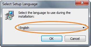
Before you can be able to test how SASS works, you need to download Ruby to your computer. Launch the Ruby installer and you will be prompted with the Setup page. Select your preferred language and click OK.
Then click on I accept the License radio button. 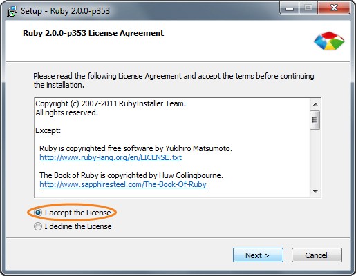
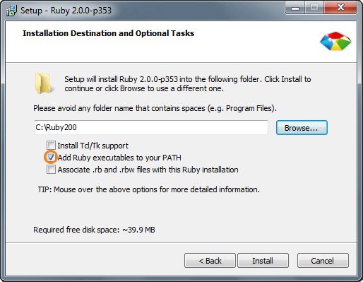
Next, install it to your preferred location and make sure that the radio button for Add Ruby executables to your PATH is checked. Click the Install button. This will install the software and when it's done installing, just click the Finish button.

Checking if Ruby is Running Properly
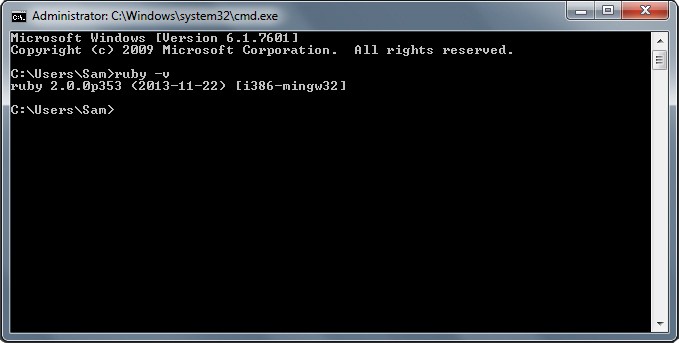
Now that you have installed Ruby, let's go ahead and check if this is working properly. Open Command Prompt and type the word ruby -v. And you can see, it would return the current version of the Ruby installed along with the date. If it's returning an error, it could be that Ruby was not installed correctly or you did not put the Ruby executable into your path.

Installing SASS
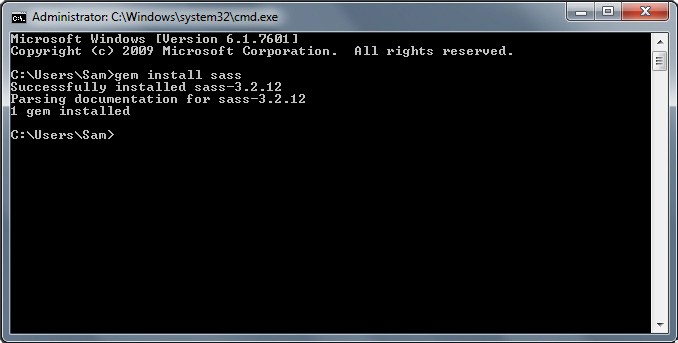
To install SASS, open Command Prompt and type the word gem install sass and you can see that the Installation Prompt that it was successfully installed.

Preparing the Necessary Files
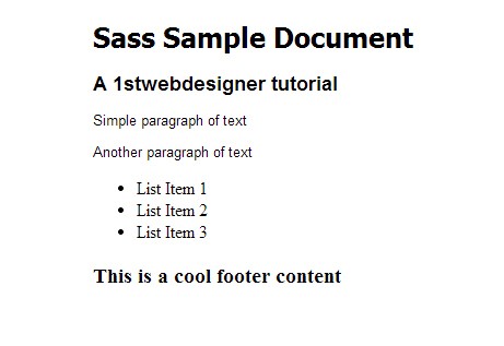
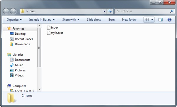
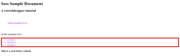
Before digging in with SASS, we need to prepare the necessary file you need before you code. Create a new folder to your preferred location (for this tutorial, I placed mine on my desktop) and name it SASS or any name you preferred. Inside the SASS folder, create an HTML file and name it index.html. For the HTML content put the following code.
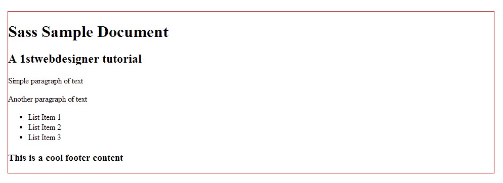
Introduction to SASS <link href="style.css" rel="stylesheet" type="text/css" /></pre> <div id="container"><header> <h1>Sass Sample Document</h1> <h2>A 1stwebdesigner tutorial</h2> </header> <div> Simple paragraph of text Another paragraph of text</div> <div> <ul id="list1"> <li>List Item 1</li> <li>List Item 2</li> <li>List Item 3</li> </ul> </div> <footer> <h3>This is a cool footer content</h3> </footer></div> <pre>
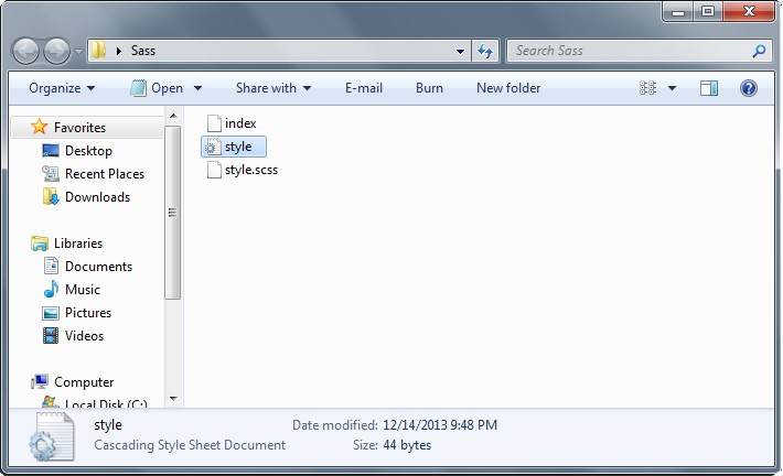
Now for our SASS file, create a new blank file in your text editor and name it style.scss. If you followed the steps, by this time you will have the following file structure.

Converting SASS code into CSS code
To convert the SASS code into CSS code, we're going to use the -watch command in command prompt. This will compile the SASS codes to CSS. Additionally, this will also watch the directories for changes or updates. Let's try to convert the SASS file to CSS file. Before we start, we need to put a sample code on our style.scss to see if this working. Copy and paste the following sample SASS code on the stye.scss file you created under SASS folder.
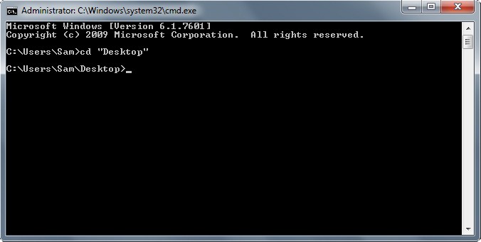
$myMargin: 0px auto; $myColor: red; $myWidth: 600px; h1 { color: $myColor; $myMargin: $margin; } Next, open your command prompt and then go to the location where you put your files in. In my case, I put it in my desktop so I will type in cd ”Desktop” and it will locate the desktop directory.

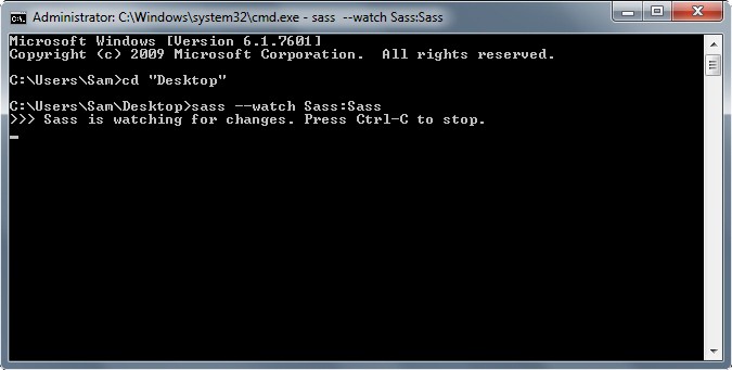
Now that we are in the desktop file directory, type in the sass –watch Sass:Sass 
Using –watch command, we will convert all of the .scss files on the folder SASS. It will also watch for the changes or updates on the file. Notice that there are two SASS, divided by a colon. The first one represents the current location of the .scss file while the second one represents the location of the output of the file. Make sure you link the converted CSS file to your HTML file to see this working.

Using Variables
SASS variables are declared using the $ character and are defined like CSS values. Using SASS, you can declare variables for styles like font size, margin, padding and so on. Using variables and giving it a style value makes it easy to reuse a style repeatedly.
There are six different types of variables you can use with SASS.
- Strings (e.g. $myString: “your text here”;)
- Numbers (e.g. $myNum: 10px;)
- Colors (e.g. $myColor: white;)
- Booleans (e.g. $myBool: true;)
- Lists (e.g. $myItemList: 1px solid red;)
- Nulls (e.g. $myVar: null;)
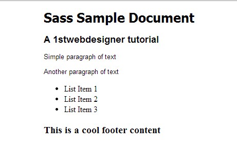
Let's put some of these types into practice. Open up your style.scss file and type the following code.
$myColor: #009a82; $myString: " some text here "; $myFontSize: 13px; $myMargin: 0px auto; $myWidth: 460px; h1 { color: $myColor; margin: 0; padding: 0; } #container { width: $myWidth; margin: $myMargin; } Now when you run this code into your browser, you will have this output.
Nesting
SASS also allows you to define nested styles. This will let you write easy-to-read codes. For instance, you have the following CSS code.
#container p { font-family: Arial; font-size: 13px; } #container h1 { font-family: Tahoma; font-size: 15px; } #container h2 { font-family: Helvetica; font-size: 14px; } For the SASS version, you will have a format like this.
$myFontsize1: 13px; $myFontsize2: 18px; $myFontsize3: 25px; $myWidth: 500px; $myMargin: 0px auto; #container { width: $myWidth; margin: $myMargin; p { font-family: Arial; font-size: $myFontsize1; } h1 { font-family: Tahoma; font-size: $myFontsize3; } h2 { font-family: Helvetica; font-size: $myFontsize2; } } Notice that we put all of the elements styles under the id container, instead of naming them one by one under the same element. If you run this code into your browser, you will have something like this.
Mixins
Mixins let you define common properties once then re-use them over and over again. Mixins are defined using @mixin directive and contains a block of codes and then reuse them using @include directive. Let’s put this into practice. Copy the code below to your style.scss file.
@mixin border { border: 1px solid red; } #container { width: 960px; margin: 0 auto; @include border; } As you can see, we use the @mixins directive to create a style for border and then we include the style to id container using @include directive. If you run this in your browser, you will have the output below.

Operators
Performing mathematical operations is one of the best features of pre-processors like SASS, something which you can't do with just a normal CSS code. Given this feature allows you do more complex and dynamic codes. Let's take a look at this how it works. Go ahead and open your style.scss file and copy and paste the code below.
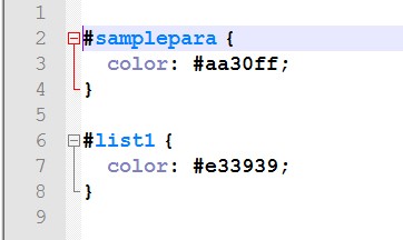
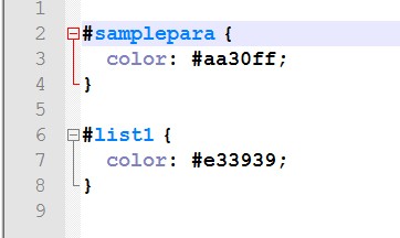
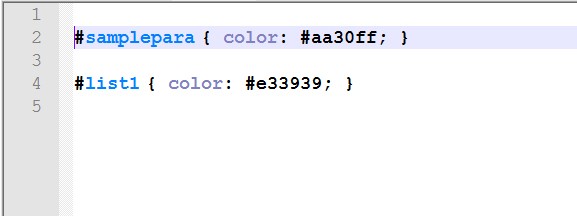
$myColor: #aa30ff; $myPadding: 20px; $thickness: 1px; $border: solid red; #samplepara{ color: $myColor; padding: $myPadding+30; } #list1 { color: $myColor; border: $thickness+5 $border; } As you can see, we perform mathematical computations by adding 30px on the padding. We also added border thickness of 5px on the border. If you run this in your browser, you can see the output will look like this.

Functions
SASS offers a variety of functions. A good example of this is the color functions where you can manipulate color styles. Check out the series of color functions below.
- darken(color, amount)
- lighten(color, amount)
- saturate(color, amount)
- desaturate(color, amount)
- alpha(color)
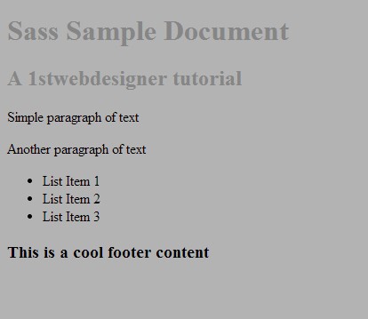
These are just series of examples of functions. To learn more about functions check out the SASS documentation. For now let’s go ahead and try this example to see how SASS functions work. Open your style.scss folder and then copy and paste the code below.
$myColor: #202020; $myBackground: #e6e6e6; body { background: darken($myBackground, 20%); } h1, h2 { color: lighten($myColor, 40%); } Notice that the color darkens by 20% using the darken function while the H1 lightens, and also the H2 text by 40% using the lighten functions. So if run this in your browser you can see similar output below.
SASS Output Formatting
One of the best features of SASS is it offers several options to control how the .scss code is formatted when compiled into CSS. Using the -style option command, we can perform formatting to our compile CSS code. The following are the SASS formatting styles.
Nested Format
Nested style is the default format of SASS. This format gives indention to all of the styles in your compiled CSS file. To see this in action, copy and paste the code below into your style.scss and then open your Command Prompt (make sure you are inside the directory of SASS) and type in SASS –update style.scss . This command will update the formatting for the compiled CSS file using the update command.

Now go ahead and open your compiled style.css file. As I've said above all of the styles will have proper indention.
Expanded Format
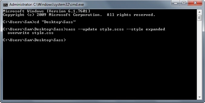
This is the most user-friendly and readable format as the braces are properly expanded and each property will have its own line. Let's see this in action. Using the same code above, open your command prompt and type sass –update style.scss –style expanded. Notice that we added –style command this is used to format compiled CSS file to a particular formatting.

So if you are going to look at the compiled CSS file on the SASS file, you can see the code formatting is similar to the image below. Notice that each property has its own line. The braces are also fully expanded.
Compact Format
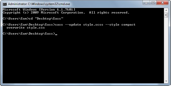
This is the compact format output CSS code in a condensed but still readable format. It adds spaces between braces but all in one line. To see how this works using the same code above, open your command prompt and type sass –update style.scss –style compact .

If you are going to check the compiled CSS file, you can see something similar to the image below. It is condensed. Each property and style is in one line.

Compressed Format
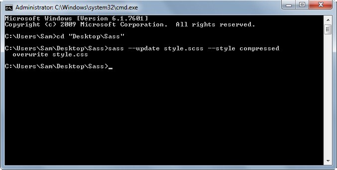
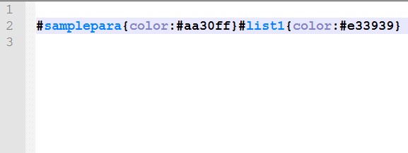
The compressed format has minimized output. This is suitable for the production environment. This format has more condensed formatting. Using the same code, open your command prompt and type in sass –update style.scss –style compressed .

So if you are going to look at the compiled CSS file on the SASS file, you can see code formatting similar to the image below. As you can see, all codes are in one line with no spaces at all. 
Conclusion
SASS offers a variety of ways to simplify your CSS issues. It allows you to reduce repetition of codes by using variables. SASS is powerful. This can help to improve the workflow of both web designer and web developers. Learn SASS now and discover how it can it help you build professional websites in a fast-paced development. Hope you enjoyed this tutorial and see you again next time.

