Monday, December 30, 2013

Why We Still Need Web-safe Fonts - Six Revisions

Why We Still Need Web-safe Fonts - Six Revisions


Why We Still Need Web-safe Fonts

Posted: 30 Dec 2013 12:07 AM PST

During the early days of the Web, there wasn’t a standard font that could be rendered across all platforms. However, some fonts — like Arial, Helvetica, and Times New Roman — were more likely to be installed in a person’s computer. These popular system fonts are called Web-safe fonts. It was the best practice in web design to stick to them.

Things have changed. It’s now safe to use Web fonts — a technique for rendering any remote font file in a web page using @font-face. This give us more creative freedom and a much wider range of font options.

The @font-face rule has been around for close to 13 years, first seen and supported in Internet Explorer 5.5[1].

And @font-face has been formally included in the most recent version of W3C’s CSS standards (CSS3) — it was taken out in CSS2.1 — and so modern browsers (e.g. Chrome, Safari, IE, and Firefox) support the rule.

And with services like the free Google Fonts API, implementing Web fonts is easy. For instance, using the Google Fonts web service, it takes two lines of CSS to render even a relatively unknown font such as Bigelow Rules in the vast majority of browsers:

  @import url(http://fonts.googleapis.com/css?family=Bigelow+Rules);  body { font-family: 'Bigelow Rules'; }  

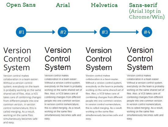
But even with near-perfect support of the @font-face rule, as a good practice, we should still use CSS font stacks. Moreover, our CSS font stacks should still include Web-safe fonts as well as generic font families like sans-serif and serif.

For example, even if we were to use the most popular font on Google’s Web font service (which is currently Open Sans), we should still use a CSS font stack that includes similar Web-safe fonts, with the last declaration in the stack being a generic font family (sans-serif in the case of Open Sans):

  body {font-family: "Open Sans", "Arial", "Helvetica", sans-serif; }  

In Chrome, this is the fallback-rendering sequence:

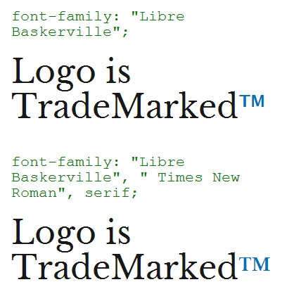
As shown above, using a good font stack assures us that we are gracefully degrading our HTML text in case our chosen font is for some reason unable to load.

Why We Still Need a Web-safe Font Stack

Web-safe fonts and CSS font stacks seem like outdated Web design practices, especially since @font-face has great support.

Right now close to 90% of the Internet’s users use a browser that supports @font-face[2].

But if you’ve ever considered dropping your CSS font stacks, below are a few reasons that might change your mind.

Incomplete Fonts

If certain characters in your font are not available, the browser will attempt to render those unavailable characters using the next font in the stack. But if you don’t have a font stack, it will use the browser’s default standard font.

For instance, the Libre Baskerville font doesn’t have the ™ character.

The first example below shows how the missing character renders in Chrome without a font stack, while the second example stacks "Times New Roman" and serif in the style rule:

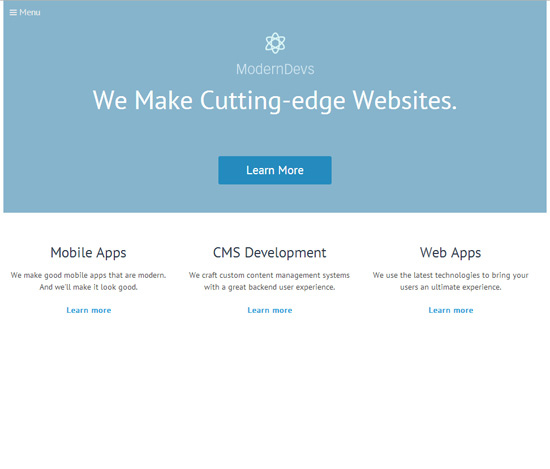
At least with a good font stack, the ™ character looks similar to the preferred Libre Baskerville font.

Network Issues

Loading a remote font using @font-face requires an Internet connection. If the web server responsible for serving the font is unavailable or is down for maintenance, the browser will use its default standard text, unless you specify a Web-safe font in your CSS font stack.

For Google Chrome, the standard text (on Windows) is "Times New Roman". This can be bad news if we were using a sans-serif font, and the web server or the content delivery network where the font file is located goes down.

For example, check out this mockup of a web design that uses the PT Sans font:

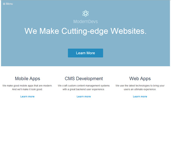
If our font stack didn’t have Web-safe fonts in the stack and a network interruption happened, our web page would render like this (in Chrome):

The web page looks completely different because Times New Roman greatly affects the visual message of the design.

But if we used a font stack that included Web-safe fonts, we can mitigate some of the aesthetic issues that come with network problems.

Using the font stack:

  font-family: "PT Sans", "Helvetica", "Arial", sans-serif;  

We are able to lower the visual impact caused by a network interruption:

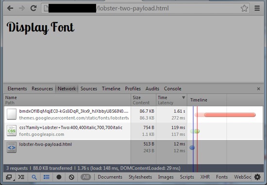
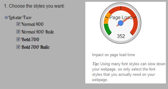
@font-face Can Be Turned Off Client-Side

Some web browsers provide the option to disable the downloading of font files.

In most cases, disabling remote font files in a web browser is obfuscated, but it’s possible. Here’s a forum post for turning off remote font downloading in Firefox and Chrome, and here’s one for Opera.

Why would someone want to disable remote fonts? To speed up web page load times, which is especially desirable for Internet users who have slow Internet connections.

To illustrate how Web fonts impact Web performance, let’s use a display font such as "Lobster Two".

The following markup was used to test  the Lobster Two payload locally using an HTML document called "lobster-two-payload.html":

  <html>
<head>
<link href='http://fonts.googleapis.com/css?family=Lobster+Two:400,400italic,700,700italic' rel='stylesheet' type='text/css'>
<style>
body { font-family:"Lobster Two"; } 
</style>
</head>
<h1>Display Font</h1>
</html>

The test conditions are a broadband Internet connection and an unprimed cache (meaning that the browser cache was cleared for each test).

#1 result. Total time: 972ms

#2 result. Total time: 1.61s

#3 result. Total time: 1.36s

In the condition tested, it would take an average of 1.3 seconds to render the <h1> tag fully for someone who has an unprimed cache.

This means staring at a blank page for 1.3 seconds before the user can read the text, because Chrome’s default behavior is to show no text while the font is still loading[3].

Consider that 1.3 seconds is the average load time using a broadband connection to download the font files from Google’s servers. Imagine how long it would take in less-than-ideal situations, such as slow mobile networks and using a shared-hosting server to serve the font.

Without the Web font, the same document would finish rendering in an average of only 0.012 seconds, which means the font increased the load time by 10,733%. That is a hefty price to pay for rendering a novelty display font that’s not functional enough to be used for critical website content. That’s why some users choose to disable remote font files from loading.

If we want to gracefully degrade our web design in situations where the user has chosen to disable remote font files, we should use Web-safe fonts in our font stack.

It must be noted here that you don’t have to load the entire font family. And if you use the Google Font service, you can selectively load just the font variations you need.

Web-safe fonts = Cheap and Easy Graceful Degradation

Though it’s rare, @font-face isn’t supported in a few web browsers, especially old ones.

Earlier, I mentioned that 90% of Internet users use a browser that supports @font-face.

Not having a font stack that includes Web-safe fonts and a generic font family means that we aren’t controlling how our web design degrades for at least 10% of the Internet’s users.

The time and effort required to use a simple CSS font stack that includes Web-safe fonts is very small, so there’s little reason not to continue doing it.

References

  1. The SitePoint CSS reference for @font-face has a table showing @font-face as being supported in Internet Explorer 5.5+.
  2. According to The Can I use @font-face Web fonts compatibility table, 89.84% of the Internet population uses a browser that has full or partial @font-face support. This data is from StatCounter Global Stats, November 2013.
  3. See the description of the browser-specific Web font rendering behaviors on the Google Developers site. This is outdated because as of Firefox 4 (officially released March 2011), loading Web fonts now behave similar to WebKit-based browsers.

Related Content

About the Author

Alexander Dawson is a freelance web designer, author and recreational software developer specializing in web standards, accessibility and UX design. As well as running a business called HiTechy and writing, he spends time on Twitter, SitePoint’s forums and other places, helping those in need.

The post Why We Still Need Web-safe Fonts appeared first on Six Revisions.

Sunday, December 29, 2013

1stwebdesigner

1stwebdesigner


A Web Designer’s New Year’s Resolution

Posted: 29 Dec 2013 06:00 AM PST

2014 is just at our doorstep, but before all the countdowns, fireworks, the food and the singing of Auld Lang Syne while drinking a nice brew of beer, let us think of ourselves and find what we can change. Let's make our New Year's resolutions as web designers.

These resolutions will improve us as web designers. As we mature and grow older, we, too, must progress for if we do not evolve, we die. The Internet, which is the platform where we do our work, is vastly changing and improving. That is why we should do the same.

14-2014-new-Years-resolution-01

(photo from Kenny Teo)

Without much ado, here's 1stwebdesigner's version of New Year's resolution for web designers.

Use Creative and Appropriate Fonts.

14-2014-new-Years-resolution-02

(photo from Andy Schaufler)

It has been discussed a lot of times that using the correct fonts for a particular design is very important. It determines the consistency and creativity of the whole output. With this in mind, let us, for 2014, use creative fonts while taking note that readability is still the main focus.

For this, you may read the following:

Revolutionize Your Color Scheming

14-2014-new-Years-resolution-03

(photo from Neal Stratton)

Most designers pick up a certain color scheme for all of their designs. It's an inevitable curse for a designer. We tend to put something we like. For 2014, how about creating a design that does not involve your favorite colors?

For this, you may read the following:

Say No to Clients

This is the most difficult thing to do, especially for starting freelancers. Saying NO would mean turning down money. But, as a designer, you have to put in mind that you have to say no at times. You have to turn down money, for once, because you can't finish the project, nor will you enjoy a little bit of it. That is the point of being a freelancer in the first place. You get to choose what you want to do and what you do not want to do. So, next time a client offers you something you can't finish, turn it down. There is nothing wrong with that. What's bad is that you say yes but not finish anything at all.

For this, you may read the following:

Learn How to Write a Copy

14-2014-new-Years-resolution-05

(Photo from greencorfu.com)

Okay, you might think that you are a web designer and what is the point of learning how to write? Well, you have to learn how to sell your services. And nothing, I repeat, nothing is better, more efficient and more affordable than copywriting. With that being said, why don't you learn how to do it, instead of hiring another person? Right?

For this, you may read this:

Make Original Designs

14-2014-new-Years-resolution-06

(Photo from orgutcayli)

Originality is a key aspect in web design. Though technically, nothing is original, you should always try to re-invent your designs. Take inspiration from a lot of websites, projects and resources on the Internet, and from these inspirations, you get the best of them and put them in one design. Now, that is original.

For this, you may read this:

Learn New Things

14-2014-new-Years-resolution-07

(Photo from CollegeDegrees360)

As I have said in the introduction, if we do not evolve, we die. The Internet has given a lot of new trends, ideas and information over the past years and as web designers, we should take what will be beneficial from our designs. Learn new techniques on how to become more productive, creative and earn more money. Learn from tutorials like these:

Start a Blog

14-2014-new-Years-resolution-08

(Photo from ambodia4kidsorg)

Blogging may be one of the least concerns you have in mind as a designer. However, no matter how less prioritized blogging is in the world of web design, it is a very potent tool in venting out your daily frustrations and everyday quirks, and monitor your progress in the near future. Think of it as a daily journal where you could record everything that happens to you so you can assess yourself afterwards. This does not improve your design but it makes you a better designer.

For this, you may read:

Update Your Portfolio and Your Résumé

14-2014-new-Years-resolution-09

(Photo from peakforce.net)

It's 2014! I'm sure the past year has given you a fair amount of workload. Put your best projects in your résumé and portfolio. When clients see this, you will be given a great deal of advantage against the other prospects because you have put your best projects in the front line.

Read this for more information:

Be Organized and Time-conscious

14-2014-new-Years-resolution-10

(Photo by David)

Time is of the essence. Learning how to manage your time and organizing it will be advantageous for you next year. With the impending workload you will receive, you might as well be prepared for it. Learn how to manage your time with your projects and put your best in everything!

Have a Niche

14-2014-new-Years-resolution-11

Photo from  Pete Prodoehl

For bloggers, niches are very important because these define who they are as writers. It’s great to be known as 'the best at something'. People crave for the services of experts because these experts studied, practiced and did extensive research in their chosen fields for a long time. As web designers, we could also be like that. We can specialize in a particular brand of design or coding language. For this, we should learn and re-learn a specific field and become a master at it. Remember, being a king of something is still better than being a jack at everything.

Teach Others

14-2014-new-Years-resolution-12

(Photo from Contra Costa Times)

One of the most fulfilling things as a designer is to become a teacher. Having an apprentice who will continue your philosophy, style and way of living as a designer is nothing short of being great. So on 2014, teach someone!

Take a Vacation

14-2014-new-Years-resolution-13

(photo from  degghi)

All work and no play makes Jack a dull boy. For 2014, make it a point that you take a break. Find a place where you could simply unwind and replenish your creative juices. Soothe yourself with a week off work and find inner peace. You will be surprised at how refreshed you are when you come back. Remember, any computer needs to reboot or refresh at times.

Design Outside Your Comfort Zone

14-2014-new-Years-resolution-14

(Photo from bentremblay)

Try this one for once. Going out of your comfort zone will lead you to discover your hidden potentials. As a web designer, you shouldn’t be limited to where you are comfortable at. Try out things you haven't tried before. You'll never know, you might become a better designer because of this.

Make Mistakes

14-2014-new-Years-resolution-14

(Photo from Mike Gifford)

The 14th resolution for 2014 is to make mistakes. For this coming year, you will delve into a lot of projects and, of course, you will make mistakes, some minor, some grave – but you should put in mind that these mistakes are learning experiences that will make you a better designer and person. So next time you commit an error, accept and learn from it.

Conclusion

There you have it, the 14 New Year's resolution for 2014! We hope that you could follow up on these resolutions all year long. We know that it's hard to keep up, but we'll try to help you out. Remember, we're all in this together. So, in behalf of 1stwebdesigner.com, happy new year and let us complete our resolutions together.

What are your New Year's resolutions as a web designer?

Tuesday, December 24, 2013

Advanced Image Optimization Tricks - Six Revisions

Advanced Image Optimization Tricks - Six Revisions


Advanced Image Optimization Tricks

Posted: 24 Dec 2013 12:28 AM PST

You can use automated image optimization tools to compress your images. However, if you also take the time to manually optimize them, you can further improve your results. Here are five techniques for manually optimizing images.

Gaussian Blur JPEG Optimization

Gaussian blur softens the details of an image. In photo-editing, it’s typically used to enhance a photo’s quality or to give it an interesting visual effect.

However, if you only introduce a small amount of Gaussian blur to a photo — an amount that doesn’t alter its visual fidelity too much — you can lower its file size.

Demonstration

The following image is 60.9 KB:

We’ll open the image in Photoshop and then we will apply Filter > Blur > Gaussian Blur.

We then increase the Radius option until it starts to noticeably reduce the sharpness of the image. When then choose a value that’s visually acceptable to us.

After applying the Gaussian Blur filter, we then save our image in the normal manner.

Here is the optimized image:

The optimized image is 58.7 KB — a 3.6% decrease in file size.

Image Posterization

Posterization allows us to lower the file size of an image without harming the perceived image quality too much. Posterization works by converting continuous color gradients into non-continuous segments that require fewer colors to render.

Demonstration

In this demo, I will use a PNG image from a freebie:

The PNG image above is 51.0 KB.

I opened the PNG image in Photoshop to posterize it.

To posterize the image, go to Image > Adjustments > Posterize. In the Posterize dialog window, check the Preview option to see your edits in real-time. Set the Levels option to the lowest possible value you can get away with.

For my example, at a Levels value less than 76, the perceived image quality degradation is no longer acceptable to me.

After applying the image adjustment, we then just save the PNG as we normally would.

Below is the optimized image:

Because I was very aggressive with the posterization, the optimized image is only 37.6 KB — a 26.3% decrease in file size.

Further Reading

Pixel-fitting

Pixel-fitting is a useful technique for ensuring high-quality results for vector graphics that are converted to raster graphics.

Simple, non-photographic images such as icons and logos are best created as vector graphics because doing so allows us to scale them to different sizes without fidelity loss.

However, a problem often occurs when vector graphics are converted into static image formats (raster graphics) such as JPEG or PNG. When we use an image-editing software like Photoshop to automatically convert a vector graphic to a raster graphic, it tries to do its best to smooth out the edges — an automated process referred to as anti-aliasing.

The results of anti-aliasing varies. Often it leads to poor-quality results. In order to enhance the quality of the graphic, we can manually edit the pixels to make sure they fit inside the pixel grid. This is called pixel-fitting (or pixel hinting).

Source: dcurt.is

Using an image editor such as Photoshop, you can zoom into the vector graphic and then manually move its vector paths a bit until they fit perfectly inside the pixel grid before you save the vector as a raster:

Pixel-fitting only works for straight lines so you will have to rely on anti-aliasing to display curves.

Further Reading on Pixel-fitting

8-pixel Grid JPEG Optimization

I came across this trick from Smashing Magazine’s article called Clever JPEG Optimization Techniques. In the same article, you will also find other useful tricks for optimizing JPEGs.

A JPEG image is divided into 8x8px blocks, and each block can be treated as its own entity.

By carefully aligning parts of the image within the 8x8px grid you can lower the file size of the image as well as get better image-quality results.

To demonstrate: I created two identical 8x8px square objects that I then saved in JPEG using a very high compression level (to make the difference more pronounced). The top square is not aligned inside the 8x8px grid.

Notice the quality difference and the extra pixels that are rendered for the one that isn’t aligned to the 8x8px grid.

This optimization trick is useful for JPEG images containing rectangular objects because you can easily fit them in a grid.

Further Reading

  • JPEG optimization. Part 1 — Sergey Chikuyonok (author of the Smashing Magazine article mentioned above) discusses the 8x8px JPEG concept in this tutorial

Selective JPEG Compression

The way typical JPEG compression works is a fixed level of compression is applied to the entire image.

In selective JPEG compression, we manually specify different compression levels for different areas of the image.

For example, we might want important areas of a photo to have a lower level of compression/higher-quality because we want to ensure that those areas look good. But then for other parts of the same image, like the photo’s background and low-detailed sections, we might be able to get away with a higher level of compression/lower-quality.

Demonstration

Selective JPEG compression can be done using Adobe Fireworks.

The photo below is compressed at a quality level of 80. Its file size is 54.0 KB.

Looking at the original photo, it appears that we use selective image compression, particularly by increasing the compression/lowering the quality of the blue sky in the background and most of the black wires.

In Adobe Fireworks, we can mask the areas we want to protect. The masked area will have a higher quality level (80)/lower image compression. The rest of the image — the parts that are not masked — will get a lower quality level (60)/higher image compression.

We can use one of the Lasso tools (in my case, I used the Polygon Lasso tool) to place a marquee selection around parts we want to protect.

Once you are done selecting around the high-quality areas, go to Modify > Selective JPEG > Save Selection as JPEG Mask.

The parts of the image that will have a quality level of 80 will now be highlighted:

In the Optimize panel, lower the Quality option to 60 and set the Selective quality option to 80. (If you can’t see the Optimize panel, make sure Window > Optimize is checked.)

Then just go to File > Save as to save the original image as a JPEG.

The image shown below uses selective compression. It’s 50.2 KB – a 7.0% decrease in file size versus the non-selective compression I showed you earlier.

You will have to play around with the selective compression settings and masking in order to get your desired results. In the case example above, detail-oriented folks will notice a huge difference between the two images. However, the results of the optimization might be alright under most people’s standards.

Selective JPEG compression is very time-consuming and the file size reduction is only slight in most instances. It’s impractical if you’re dealing with a lot of photos. However, if you are really concerned about optimizing image quality and image file size, this is one option.

Further Reading

Conclusion

There are simpler ways to optimize an image. Just using automated tools such as Photoshop’s Save for Web & Devices command and lossless compression tools like Smush.it can greatly reduce your image file sizes.

However, if you’re looking for finer image optimization control and even more file size reductions, try out the tricks above. An ideal workflow would be to use a lossless compression tool like Kraken.io or Smush.it, which will remove a big chunk of your image’s file size without affecting its quality. And then you can use the appropriate tricks discussed above to fine-tune your results.

Related Content

About the Author

Rahul Mistry a web design enthusiast and writer for Heart Internet. Connect with Rahul on Twitter @mistry213 and Google+.

The post Advanced Image Optimization Tricks appeared first on Six Revisions.