Improving Web Form Conversion Performance - Six Revisions |
| Improving Web Form Conversion Performance Posted: 03 Nov 2014 02:00 AM PST Optimizing your web forms for conversion can have a huge impact on the success of your site. Higher form-completion rates translate to improvements in key success indicators like user sign-ups, lead generations, online sales, and so on.
Some types of web forms you may want to optimize are:
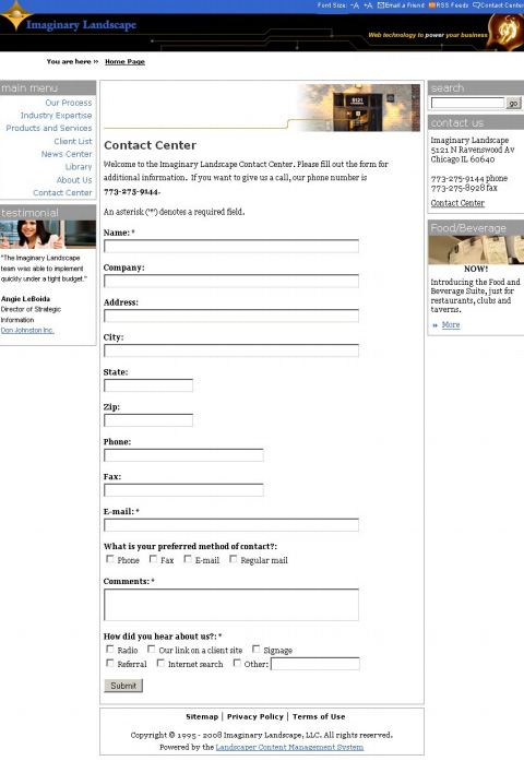
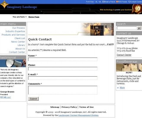
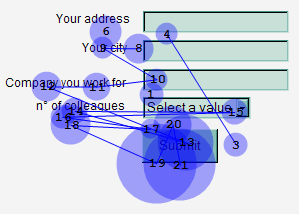
We know most people don’t like filling out web forms –no one wants to fill out a web form if they don’t have to — and so we need to use all the tricks in the book to compel our users to interface with our forms. In this article, we will discuss some research-backed suggestions for improving the conversion-rate performance of your web forms. Reduce the Number of Form FieldsThe amount of time it might take to fill out a web form can have a big impact on a person’s desire to interface it. The easiest way to shorten the time required to complete a web form is simply to lower the amount of data the user has to provide. Limit the data you collect to ones that are absolutely essential. A case study published by web development firm Imaginary Landscape reports that when the amount of form fields in their site’s contact form was reduced from 11 to only four, the number of web form submissions increased by 140%. Original Contact Form
Redesigned Contact Form
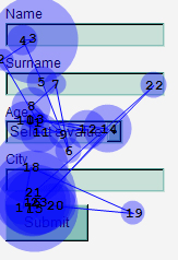
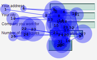
In the redesigned contact form, they stopped asking users for their street address, fax number, preferred contact method, and "How did you hear about us?" because, presumably, these were not critical information to know during their first contact with potential project clients. The information can always be asked later on if the web development project were to actually move forward. Place Labels on Top of Input FieldsTop-, right- or left-aligned labels — which is best? A good option is top-left-aligned labels. Positioning the labels in this manner might be better than your other options because users can read and see the label and its respective input field in a single eye-fixation. This eye-tracking study conducted by UX Matters shows that when the labels are at the top of input fields and flush-left of the input fields, there were fewer eye-fixations, an indication that the web form is more readable when laid out this way.
In contrast, putting the labels beside their input fields (as shown in the images below) can cause our eyes to make two fixations instead of just one, essentially doubling the effort needed to read the contents of the web form:
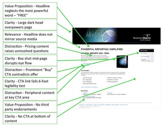
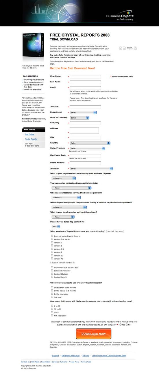
Improve the Visual Scale of Calls-to-ActionThe position of elements in the visual hierarchy of a web form can play a large part in its conversion-rate performance. A landing page optimization case study by WiderFunnel, a marketing company specializing in conversion optimization, reported a 32.5% conversion-rate increase in a landing page they were working on for SAP (a large, multinational software corporation). In the landing page, SAP offered a free download of their software after filling out a web form. The web form’s conversion rate was improved significantly just by placing a large, orange call-to-action (CTA) button on the page. Original Landing Page Design
Landing Page Design Variation A
Landing Page Design Variation B
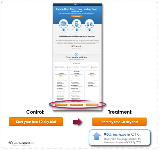
Variation A — the one with the large, orange button near the top of the web page — increased conversions the highest. Variation B, which displayed the web form the user needed to be fill out and which had the same large, orange button at the bottom of the web page, still increased conversion-rate performance by 17% compared to the original landing page design. The results of the case study suggest that the size and visibility of your call-to-action can improve web-form-submission rates. Optimize the Wording of LabelsIn a case study discussed in this article, a split test on the landing page of the Unbounce.com software was conducted. After reviewing the page, Unbounce decided it would be better to make the call-to-action button text more aligned with their users. The only change they made was to update a word in the button’s text, changing the word "your" to "my". The original call-to-action button was worded "Start your 30 day free trial" while the redesigned button said "Start my 30 day free trial". After running the split test for three weeks, the text "Start my free 30 day trial" had increased the click-through rate to the sign-up web form page by 90%.
Increase Form Friction to Improve Submission QualityIn some instances, you may not want to increase your web form’s conversion rate. Sometimes, your main focus is on optimizing the quality of the form submissions, even if it means a reduction in form submissions. This may be due to the price points of your products or services; perhaps you want to get more form submissions from potential clients that meet the financial requirements needed to hire your company. In these types of situations, having more form conversions can lead to losses instead of gains, because you will need to spend more time and resources processing web form submissions to find ones that are a good fit for your business. One way to improve the quality of form submissions (lead quality) is to ask people what their budget for your services is. This reduces the number of form submissions coming from users who don’t have the capital needed to work with your business, saving you time from writing project proposals and pitching to the wrong prospective clients.
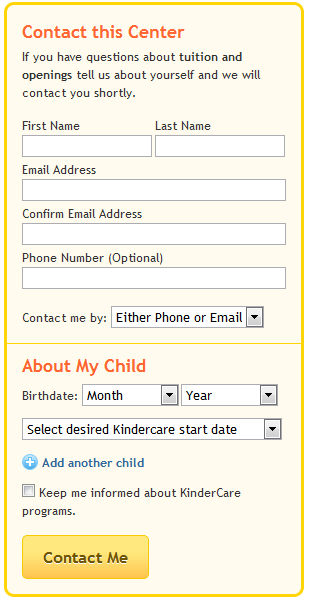
An article published on Econsultancy discusses a case study of Kindercare where the childcare service provider was able to improve their lead quality by adding an extra form field on their site’s contact form. Original Contact Form
Redesigned Contact Form
Both contact form designs were the same, apart from the redesigned version having a new "Comments or Questions" field. This is what the author of the article said about the Kindercare results: "To their utter surprise, conversions remained stable. There was no reduction in leads generated from the longer form! Plus, the sales team reported that the quality of the leads increased." Further Reading
About the Author
The post Improving Web Form Conversion Performance appeared first on Six Revisions. |


| You are subscribed to email updates from Six Revisions To stop receiving these emails, you may unsubscribe now. | Email delivery powered by Google |
| Google Inc., 1600 Amphitheatre Parkway, Mountain View, CA 94043, United States | |
No comments:
Post a Comment