1stwebdesigner |
| How to Create a Registration Page Validation Using jQuery Posted: 22 Jul 2014 06:00 AM PDT Registration page validation using jQuery ensures that the information provided by the user is correct so the user can fill out the complete online form easily with little amount of time. Although HTML5 has a validation form feature and there are many of JavaScript plugins out there, you must carefully choose the best one that will work on old browsers as well as for your cross-browser functionality considerations. In today’s tutorial, I will show you how to set up a front-end validation that will work on old browsers. I will also be using the jQuery plugin name Validator jQuery Plugin by Yair Even-Or. There is a live demo download package that you can check out. So let’s get started.
Resources You Need to Complete This Tutorial
What We Are Going To Do
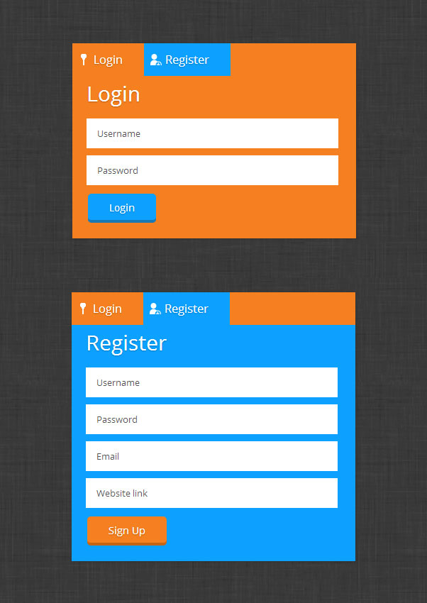
Setting UpFirst, we need to set up our CSS and JavaScript libraries links on our head section. <!DOCTYPE html> <html lang="en"> <head> <meta charset="utf-8"> <title>Create a Flat Login/Sign up Page with Validation, Styling & Semantics Of Forms jQuery Plugin</title> <link href="css/style.css" media="screen" rel="stylesheet"> <link href="css/reset.css" media="screen" rel="stylesheet"> <link href='http://fonts.googleapis.com/css?family=Open+Sans:300italic,600italic,700italic,800italic,400,300,600,800' rel='stylesheet' type='text/css'> <script src="//ajax.googleapis.com/ajax/libs/jquery/1.10.2/jquery.min.js"></script> <script src="js/validator.js"></script> <!--[if lt IE 9]> <script src="dist/html5shiv.js"></script> <![endif]--> </head> The HTMLFor our HTML file, we’re going to wrap everything in a container class, followed by class flat-design-form and then set up our menu tabs, which is an unordered list, with a class tabs. <div class="container"> <div class="flat-design-form"> <ul class="tabs"> <li><a class="active" href="#login" id="login-tab" name= "login-tab"><span id="login_icon"></span> Login</a></li> <li><a href="#register" id="register-tab" name= "register-tab"><span id="signup_icon"></span> Register</a></li> </ul> Next, we’re going to create a div with an ID of login and a class of form-display and class show. These two classes will be used by the jQuery code later to hide and show our login and registration sections. Then, we we’re going to wrap items with a class item. <div class="form-display show" id="login"> <h1>Login</h1> <form action="" method="post" novalidate=""> <fieldset> <ul> <li> <div class="item"> <input data-validate-length-range="6" name="name" placeholder="Username" required="required" type= "text"> </div> </li> <li> <div class="item"> <input data-validate-length-range="6" name= "password" placeholder="Password" required= 'required' type="password"> </div> </li> <li><input class="button-login" type="submit" value= "Login"></li> </ul> </fieldset> </form> </div> Notice that we use a semantic data-validate-length-range=”6″. This will be used by our validator jQuery plugin to limit the range of text entered on a specific field. To check on the list of semantics, you can use for this jQuery plugin, you can check here. Now that we're done with the login section, let's move on the registration section. For the registration section, we’re going to wrap everything with a div that has an ID register and a class form-display and class hide. By default, this section will be hidden. And then, again, we will wrap each item with a class of item and use semantics for specific fields. <div class="form-display hide" id="register"> <h1>Register</h1> <form action="" method="post" novalidate=""> <fieldset> <ul> <li> <div class="item"> <input data-validate-length-range="6" name="name" placeholder="Username" required="required" type= "text"> </div> </li> <li> <div class="item"> <input data-validate-length="6,8" name="password" placeholder="Password" required='required' type= "text"> </div> </li> <li> <div class="item"> <input class='email' name="email" placeholder= "Email" required="required" type="email"> </div> </li> <li> <div class="item"> <label><input name="url" placeholder="Website link" required="required" type="url"></label> </div> </li> <li><input class="button-register" id='send' type="submit" value="Sign Up"></li> </ul> </fieldset> </form> </div> By this time, you can get similar look like the image below.
The CSSFor our CSS, let’s start adding the general styles. This will include the style for the body and class container. body { background: url('../img/low_contrast_linen_2X.png'); color: fff; font-family: 'Open Sans'; } .container{width: 960px; margin: 0 auto;} Now, let's style our menu tabs. .flat-design-form{ background: #f58020; margin: 130px auto; width: 400px; height: auto; position: relative; font-family: 'Open Sans'; -webkit-box-shadow: 1px 1px 2px 0px rgba(50, 50, 50, 0.75); -moz-box-shadow: 1px 1px 2px 0px rgba(50, 50, 50, 0.75); box-shadow: 1px 1px 2px 0px rgba(50, 50, 50, 0.75); } #login { padding-bottom: 20px; } #register { background: #0DA1FF; padding-bottom: 20px; } #login-tab { background: #f58020; } #register-tab { background: #0DA1FF; } span#login_icon { width: 16px; height: 16px; left: 8px; position: absolute; background: url(../img/login.png)no-repeat; display: block; } span#signup_icon { width: 16px; height: 16px; left: 110px; position: absolute; background: url(../img/sign-in.png)no-repeat; display: block; } .tabs { height: 40px; margin: 0; padding: 0; list-style-type: none; width: 100%; position: relative; display: block; margin-bottom: 6px; } .tabs li { display: block; float: left; margin: 0; padding: 0; list-style: none; } .tabs a { display: block; float: left; text-decoration: none; color: white; font-size: 16px; padding: 15px 30px 15px 30px; text-align: center; text-shadow: 0 1px 2px rgba(0, 0, 0, 0.25); } Next, let’s start styling our forms. This will include the text boxes with their specific type field. .form-display { padding: 0 20px; position: relative; } .form-display h1 { font-size: 30px; padding: 10px 0 20px 0; text-shadow: 0 1px 2px rgba(0, 0, 0, 0.25); } form { padding-right: 20px !important; } form input[type=text], form input[type=password], form input[type=email], form input[type=url]{ width: 100%; outline: none; height: 40px; margin-bottom: 10px; padding-left: 15px; background: #fff; border: none; color: #545454; font-family: 'Open Sans'; font-size: 13px; } .show { display: block; } .hide { display: none; } For our buttons, we’re going to give it a border on the bottom with a hexa color #1B78B2 to create a nice flat button. Then, we will set its hover and active state. .button-login{ display: block; background: #0DA1FF; padding: 10px 30px; font-size: 14px; text-align: center; border-radius: 5px; font-family: 'Open Sans'; color: white; text-align: center; text-shadow: 0 1px 2px rgba(0, 0, 0, 0.25); border: 0; border-bottom: 2px solid #1B78B2; cursor: pointer; -webkit-box-shadow: inset 0 -2px #1B78B2; box-shadow: inset 0 -2px #1B78B2; -webkit-transition: all 0.6s ease; -moz-transition: all 0.6s ease; transition: all 0.6s ease; } .button-login:hover { background: #1B78B2; } .button-register{ display: block; background: #f58020; padding: 10px 30px; font-size: 14px; text-align: center; border-radius: 5px; font-family: 'Open Sans'; color: white; text-align: center; text-shadow: 0 1px 2px rgba(0, 0, 0, 0.25); border: 0; border-bottom: 2px solid #c36518; cursor: pointer; -webkit-box-shadow: inset 0 -2px #c36518; box-shadow: inset 0 -2px #c36518; -webkit-transition: all 0.6s ease; -moz-transition: all 0.6s ease; transition: all 0.6s ease; } .button-register:hover { background: #fb7100; } .button-register:active { background: #136899; } Afterwards, let's set up styles for our placeholders. We will use selector and vendor prefixes to target the type of each browser. ::-webkit-input-placeholder { font-size: 13px; font-family: 'Open Sans'; color: #545454; } :-moz-placeholder { /* Firefox 18- */ font-size: 13px; font-family: 'Open Sans'; color: #545454; } ::-moz-placeholder { /* Firefox 19+ */ font-size: 13px; font-family: 'Open Sans'; color: #545454; } :-ms-input-placeholder { font-size: 13px; font-family: 'Open Sans'; color: #545454; } Finally, to make our validation form more lively, we will set up codes for our validation error with CSS3 animation. We will set each item to position relative, style its alert message and push it to the right side of each text boxes. Notice that we use CSS3 transition property to make a smooth effect when showing the error messages. .item { position: relative; } .item .alert { float: left; margin: 0 0 0 20px; padding: 3px 10px; color: #FFF; border-radius: 3px 4px 4px 3px; background-color: #ef3030; max-width: 170px; white-space: pre; position: absolute; left: -15px; opacity: 0; z-index: 1; transition: .15s ease-out; } .item .alert::after { content: ''; display: block; height: 0; width: 0; border-color: transparent #ef3030 transparent transparent; border-style: solid; border-width: 11px 7px; position: absolute; top: 5px; left: -10px; } .item.bad .alert { left: 0; opacity: 1; top: 5px; left: 343px; font-size: 12px; padding: 10px; } The jQueryFor our jQuery code for menu tabs, we're going to put on the code below. This will hide and show the login and registration section using the class show and class hide. (function($) { // constants var SHOW_CLASS = 'show', HIDE_CLASS = 'hide', ACTIVE_CLASS = 'active'; $('.tabs').on('click', 'li a', function(e) { e.preventDefault(); var $tab = $(this), href = $tab.attr('href'); $('.active').removeClass(ACTIVE_CLASS); $tab.addClass(ACTIVE_CLASS); $('.show').removeClass(SHOW_CLASS).addClass(HIDE_CLASS).hide(); $(href).removeClass(HIDE_CLASS).addClass(SHOW_CLASS).hide().fadeIn(620); }); })(jQuery); Next, let’s add the following code to enable the functionalities of our validator jQuery plugin. // initialize the validator function validator.message['date'] = 'not a real date'; // validate a field on "blur" event, a 'select' on 'change' event & a '.reuired' classed multifield on 'keyup': $('form').on('blur', 'input[required], input.optional, select.required', validator.checkField).on('change', 'select.required', validator.checkField).on('keypress', 'input[required][pattern]', validator.keypress); $('.multi.required').on('keyup blur', 'input', function() { validator.checkField.apply($(this).siblings().last()[0]); }); // bind the validation to the form submit event //$('#send').click('submit');//.prop('disabled', true); $('form').submit(function(e) { e.preventDefault(); var submit = true; // evaluate the form using generic validaing if (!validator.checkAll($(this))) { submit = false; } if (submit) this.submit(); return false; }); ConclusionThat's it! You're done! In this tutorial, we’ve created a flat webpage with a smooth animation and validation using CSS3 and validator jQuery plugin. This is not just the jQuery plugin you can use. There are a plenty of jQuery out there but, for me, I find this easy to use with a cool animation for alert messages. Hope you enjoyed this tutorial and see you again next time! |
| Don’t Be a Wimp with GIMP Tutorials Posted: 22 Jul 2014 03:00 AM PDT GIMP is the GNU Image Manipulation program. It has been distributed as an open source, so therefore, anyone can easily download the software without any donation. It can easily work on different operating systems. It is also available in many languages as well. Are you ready for some awesome GIMP tutorials? You can use GIMP in a variety of web designing activities such as:
GIMP is packed with plenty of awesome features.
If you are interested in learning and doing all these, there are plenty of tutorials available for you. No matter if you are a beginner or an advanced level user, these below tutorials will be very helpful to you in leaning the new techniques of GIMP. 1. Creating Fireball and Explosion Effect
This tutorials is for intermediate GIMP users, having basic knowledge of layers mask and other tools. In this tutorial, you will learn to transform a stock image into a fireball and explosion. 2. Cool Typography Design Poster
In this tutorial, you will learn how to create a cool typography design poster. You will also learn to make some elements look dirty and also how to add textures to the design. 3. Gold Text Effect
This is a very great looking tutorial that is adapted from the tutorial of Photoshop and shows us how to create a gold text effect by using the GIMP. 4. Neon Lights Tutorial
This tutorial shows us how to implement a good animated menu by using MootooIs and, some lines of CSS and HTML. 5. Recoloring Eyes
In this tutorial, you will learn an easy way to recolor the eyes. 6. A Colored Swirl of Light
This is also a great looking tutorial in which you will learn great effects, usable for all kinds of graphics such as the flyers, wallpapers, etc. 7. Making a Pencil Drawing from a Photo
This tutorial teaches you to convert any image into a good looking pencil drawing, and there is no need of edge detection filters. 8. Gimp Sin City Tutorial
You can learn how to create a dramatic effect by using the GIMP in this tutorial. It is very useful for everyone. 9. Flame Abstract Tutorial
In this tutorial, you will learn on how to use the flame filters in order to make a simple abstract background. 10. How to Create Light Saber Effects
In this tutorial, you will learn to create a light saber effect. It is very interesting to learn through the GIMP. 11. Vista-Like Wallpaper
In this tutorial, you will learn to create a very beautiful way to create wallpaper that is exactly as the one you saw in Vista. 12. Advanced Photo Separation
In this tutorial, you will learn a clean way to separate an object in the photo from its background. 13. Cool Circle Light Effect
You will learn to create a cool circle light effect by using GIMP. It is inspired from the White Photoshop tutorial. 14. Make an Extremely Real Letter
Learn how to create an extremely real letter effect by using GIMP. 15. Creative Composition
This tutorial shows you how to create a creative composition for your photos. 16. Colorful Glowing Text Effect
You can learn to create a glowing text effect that will look perfect on every picture and image. 17. Split-Toning
This tutorial teaches you to have certain colors for highlights and certain colors for shadows. 18. Fun With Light
This tutorial shows you how to transform an ordinary light of a bulb to a stunning masterpiece of your own. 19. Super Slick Dusky Lighting Effects
This tutorial shows you to how to create a super slick dusty lighting effect by using the GIMP. 20. Contaminated Effect
This tutorial shows you how to create an awesome looking illustrated effect by using the techniques of GIMP. ConclusionGIMP has the ability to make your ordinary looking image and photos into great looking images that you will surely appreciate. These tutorials are extremely good and created by the experts so you don't have to worry about it. If you know any other tutorial, please share it with us in the below comment section. |


| You are subscribed to email updates from 1stwebdesigner To stop receiving these emails, you may unsubscribe now. | Email delivery powered by Google |
| Google Inc., 20 West Kinzie, Chicago IL USA 60610 | |
No comments:
Post a Comment