Digital Typography Needs to Move Forward - Six Revisions |
| Digital Typography Needs to Move Forward Posted: 11 Jun 2014 03:00 AM PDT Digital typography is relatively old. With digital type having been around for 30 years, it’s surprising to me that we still haven’t moved much outside of the concepts we have borrowed from print.
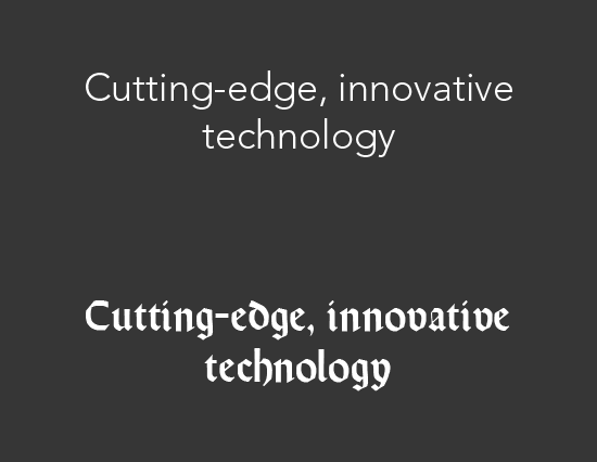
I deal with text on the Web every day. Whether it’s creating it or reading it. Both of these tasks reveal to me how underdeveloped digital typography is compared to other digital technologies. Typography is a key element of the reading experience. Throughout history, typographers were always searching for opportunities to improve and further understand their craft. For example, semiotic typography (PDF) introduced new ideas for experiencing written material. In semiotics, the concept is a letter is realized as a symbol (signifier) which carries a number of connotations based on its style, size, and color. Words go beyond their linguistic (denoted) meaning and into visual (connoted) meaning. Look at the following example. The text blocks have the same literal meaning, yet the impression they make on the reader is different.
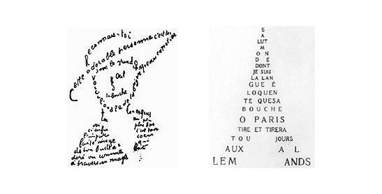
The reason for this difference is our brain reads text like a photograph, automatically processing any contextual information it can find. As for the artistry side of typography, in the 19th century, poet Guillaume Apollinaire was greatly known for his calligrams, a manner of arranging typography to create a visual image.
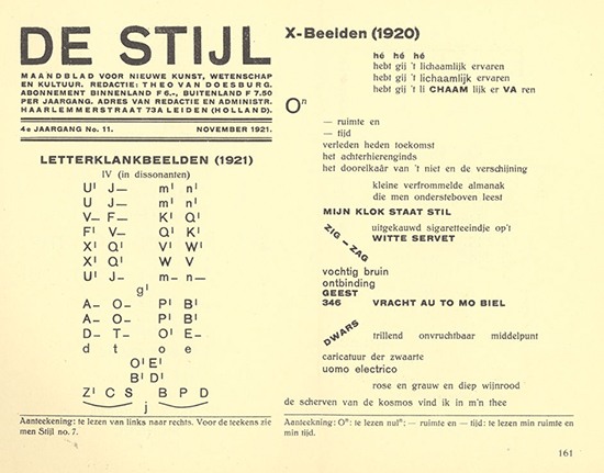
Later on, De Stijl introduced the concepts of typographic hierarchy and text emphasis (bolds, italics, capitalization, etc.) which was widely acquired and popularized by the Bauhaus and Constructivist movements.
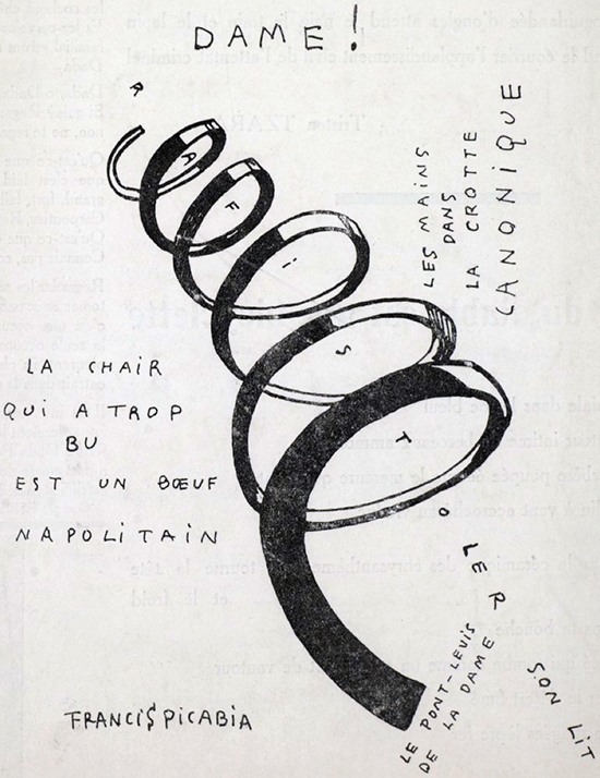
Futurists and dadaists took a more risky approach by defying the existing concepts of a page structure.
Neville Brody applied some elements of that rebellion in his own work for print and for Web.
What About Digital Typography?Let’s get back to digital typography. With the shift from paper to screen, it’s been long-discussed which one is superior over the other. While "superiority" can be measured using a number of factors, one remains to be the most important: readability. An article on Scientific American by Ferris Jabr reports on a couple of studies about readability in digital screens. This is what Jabr said in the article:
According to the piece, reading on a digital device actually inhibits reading comprehension and makes it harder to remember what you’ve just read, compared to reading from traditional paper. Moving ForwardWe need to start innovating instead of adapting. For example, we know people on the Web don’t read; they scan. To adapt to the situation, we use all sorts of tricks like headings, bullet points, cutting out details about the subject, lowering the difficulty level of the words we use and so on. The problem is that we are focusing on trying to hold on to those tiny bits of our readers’ attention, instead of looking for ways to get people to engage with and read online content more fully and more deeply. We are adapting to the current reality, when we should be trying to reshape the way people interact and experience the written word on their screens. Check out this example at Stories For Your Screen, a brilliant way of leveraging modern Web technologies and user interactions to make reading lengthy texts more captivating.
Yet another example is this interactive tutorial by Code School called Try Git.
For a technical and code-heavy system like Git, Code School’s interactive guide has made the act of learning about the subject more engaging, enjoyable and, most importantly, more learnable. There is so much potential for innovation in the art and science of digital typography. We need to explore opportunities that could enhance the reading experience on digital devices. Related Content
About the Author
The post Digital Typography Needs to Move Forward appeared first on Six Revisions. |

 Justina Bakutyte works for
 | You are subscribed to email updates from Six Revisions To stop receiving these emails, you may unsubscribe now. | Email delivery powered by Google |
| Google Inc., 20 West Kinzie, Chicago IL USA 60610 | |
No comments:
Post a Comment