Building Localization-Ready Websites: Tips and Things to Consider - Six Revisions |
| Building Localization-Ready Websites: Tips and Things to Consider Posted: 09 Jun 2014 03:00 AM PDT Only 5.3% of the world’s population speaks English as their first language. Research shows that in order to reach 90% of Internet users, we need to be able to support 21 languages1. If you are trying to reach a global audience, language localization is an important factor to consider when developing a website.
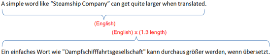
Language localization is the process of adapting a product for other countries and regions2. The biggest benefit of localization is the ability to reach a bigger global audience. Website language localization can present many challenges for web designers and developers. I will share a few tips and considerations to make the process smoother. Localization-Readiness Requires Adaptive DesignOne of the foundations for building a website with localizability in mind is having the foresight to use adaptive design and coding techniques. More than simply having a fluid and responsive page layout, you will also need to ensure that every text-containing element in the site has the ability to expand and adjust as needed. Why? There is a tendency for text to grow once it is translated from English and into another language. Look at what happens when an English sentence is translated into German:
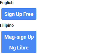
A general rule of thumb is to plan for at least 30% text expansion (give or take). Sources on this topic suggest between 20%-50% text expansion, but I have found based on my experience that 30% is a good guideline in most situations. In my line of work, I run across clients from world-renowned companies that still use static, fixed-width designs, which create localization problems. These days, you should avoid using absolute CSS units of measurements like pixels ( Instead of fixed units of measurement, relative units such as em and percentage ( Below, you can see what happens when a button with a fixed unit of measurement containing English text is translated into the Filipino language:
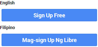
.button { display: block; width: 120px; text-align: center; } In the case above, the width of the button was set at 120px, which is a good width when the text is rendered in English. But, when translated into another language, the text’s width grew by 50% (from 105px to 175px), which caused an overflow into the next line. To resolve this issue, we must create a responsive layout that lets buttons automatically adjust in size based on the context it is being viewed in. For the specific case above, where the text overflowed because of a fixed-width property, we can either simply remove the By removing the
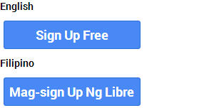
.button { display: block; text-align: center; } To give us more control over the width, we can alternatively declare a width range using the Below, you can see what the button looks like with
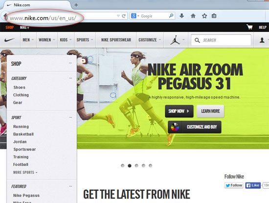
.button { display: block; min-width: 30%; max-width: 60%; text-align: center; } When developing our media queries, we should factor in this nature of text expansion so that we can either scale the font size down and/or readjust our relative units as the design starts to break when viewed at certain device widths. Website Localization TipsAside from the general philosophy of adaptive development discussed above, here are some more considerations to help you make localization-friendly websites. Use Unicode FontsUnicode fonts contain a wide range of characters, letters, digits, symbols and more, which collectively make up a universal character set derived from many different languages. Examples of popular Unicode fonts are Arial and Times New Roman. Avoid fonts that do not support Unicode to maximize your website’s ability to render characters in other languages. Avoid Using Images for Text ContentDoes your website have images that contain text? Consider replacing them with HTML, and then styling them using @font-face and CSS instead. This way, text content can be interpreted by computer-assisted translation software. Have a URL Structure Localization PlanWhen planning your website, consider localization when developing its information architecture. It’s well worth the time to develop even just a game plan for the site’s URL structure that considers the possibility of localization in the future. A couple of popular localization URL structure strategies are:
Learn About String ResourcesMany web development frameworks are localization-friendly and have prebuilt features that make localizing UI labels easier. Read up on string resource programming in your preferred development platform and, from the start, use them so that your website is ready for localization. Here are documentations to read for a few popular development platforms:
References
Related Content
About the Author
The post Building Localization-Ready Websites: Tips and Things to Consider appeared first on Six Revisions. |

 Robert Hunt is a senior localization project manager at
 | You are subscribed to email updates from Six Revisions To stop receiving these emails, you may unsubscribe now. | Email delivery powered by Google |
| Google Inc., 20 West Kinzie, Chicago IL USA 60610 | |
No comments:
Post a Comment