1stwebdesigner |
| How to Create a CSS3 Pop-Out Menu Without Learning Programming Posted: 05 Mar 2014 06:00 AM PST Modern websites offer a more complex hierarchy of navigation. This navigation sometimes makes user-experience on the website’s menu a bit confusing. Using a CSS3 pop-out menu makes it easier to find your way to what you want on the site quickly. Thanks to CSS3, animation is now possible. Using CSS3, you can simply hide and unhide an element under other elements. This will not only simplify your code but also makes it easily updated. This means you can now perform some sliding animation even without the knowledge of programming.
In this tutorial I will show you how to create a metro type menu that hides and unhides the text menu under the icons each time you mouse over it. OK, let’s rock! Resource You Will Need to Complete This Tutorial:
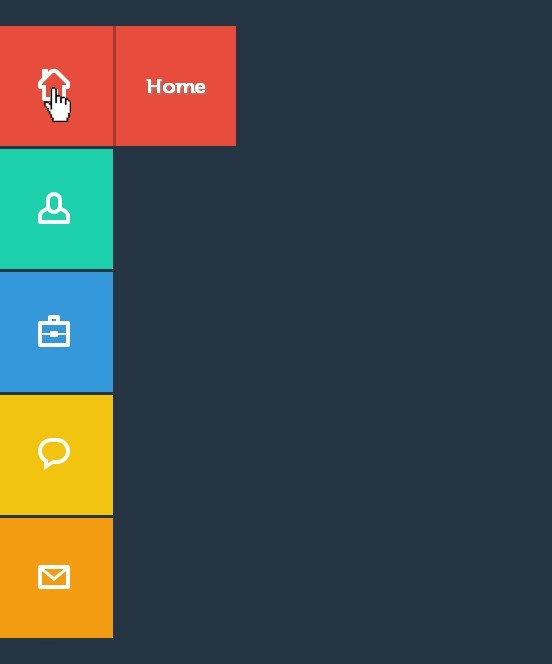
Our Final Product
File Structure
Our file structure will consist of four folders and one HTML file:
Preparing Our Menu IconsDownload the 80 Shades of White Icons. For this tutorial, we'll be using the following icons.
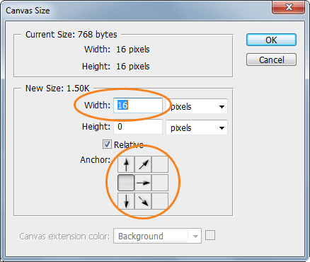
Using these icons, we'll be creating a sprite image for the icons of our menu. First, drag the Home icon on a new Photoshop file. Then go to Image -> Canvas Size and then add another 16px width on the left side. Make sure that the anchors are pointing to the right.
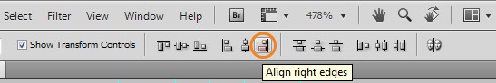
After that, place the User icon to the right side. Make sure you align them to the right properly. You can do this by pressing Ctrl – A on your keyboard and clicking the align right edges button on the Align panel.
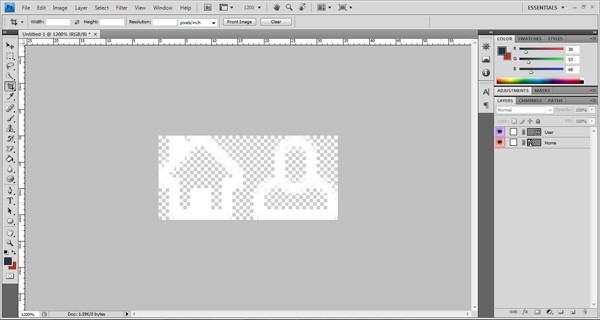
Next, repeat the same process for the rest of the icons and then finally save it as a png file.
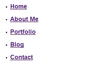
The HTML MarkupFor our HTML file, we will first add the HTML5 doctype and series of links in our head section. This will include our CSS link files. <!DOCTYPE html> <html lang="en"> <head> <meta charset="utf-8"> <title>CSS3 Pop Out Menu</title> <link href="css/normalize.css" rel="stylesheet"> <link href="css/style.css" media="screen" rel="stylesheet"> </head> The menu elements are wrapped inside an unordered list. Each element has a class of box, followed by an anchor tag, span icons and an H2 tag (for the title of the element). All of our menu is wrapped in a container class. <div class="container"> <ul class="icon-menu"> <li class="icon-box home"> <a href="#"> <span class="icon home"></span> <h2>Home</h2> </a> </li> <li class="icon-box aboutme"> <a href="#"> <span class="icon aboutme"></span> <h2>About Me</h2> </a> </li> <li class="icon-box portfolio"> <a href="#"> <span class="icon portfolio"></span> <h2>Portfolio</h2> </a> </li> <li class="icon-box blog"> <a href="#"> <span class="icon blog"></span> <h2>Blog</h2> </a> </li> <li class="icon-box contact"> <a href="#"> <span class="icon contact"></span> <h2>Contact</h2> </a> </li> </ul> After we set up our HTML markup, we should have something like this.
The CSSNow it's time for our pop-out menu to shine. First, let's import the font that we'll be using on our menu elements and titles. @font-face { font-family: Museo500-Regular; src: url('../fonts/Museo500-Regular.otf'); } Let's now add the styles for our general settings. First we will add a background with hexadecimal color of #263544 and a font face of Museo 500. And then, we will also set some styles for our anchor and H2 tags. body {background: #263544; font-family: Museo500-Regular;} a{text-decoration: none;} h2 {color: #fff; font-size: 22px; margin: 0 24px;} Next, let’s add some styles to our icon boxes where we will be hiding our text menu. Using the unordered list, let’s style the class icon-menu to hold all of our icon menu. Then, let’s style the class icon-box and give it a dimension of 120px x 120px. Now let’s use the menu name as its class to manipulate the background color of each box according to its title. ul.icon-menu {margin-top:29px;} li.icon-box {width: 120px; height: 120px; list-style: none; left: -47px; position: relative; margin-bottom: 3px;} li.icon-box.home {background: #e74c3c;} li.icon-box.aboutme {background: #1dd0ad;} li.icon-box.portfolio {background: #3498db;} li.icon-box.blog {background: #f1c40f;} li.icon-box.contact {background: #f39c12;} .icon-box h2{Museo500-Regular; font-size: 20px; text-shadow: 1px 1px 2px rgba(150, 150, 150, 1);} .icon-box a {display: block;} After that, let’s also set the positions of our menu icons using our sprite images. We will use the span tag and attach the icon class name to it and manipulate its position. span.icon {display: inline-block; background: url('../img/icon-sprites.png')no-repeat; width: 32px; height: 32px; margin: 43px 45px;} span.icon.home {background-position: 0px 0px;} span.icon.aboutme {background-position: -36px 0px;} span.icon.portfolio {background-position: -72px 0px;} span.icon.blog {background-position: -109px 0px;} span.icon.contact {background-position: -145px 0px;} For our menu name, we will use the H2 tags as our anchor tag and and we’ll set the position to absolute and then push it to the left. Using the style method z-index, we will hide the menu under its menu icon and box. Using the transition attribute, we can add an effect when changing from one style to another without using Flash animations or JavaScript. This means each time the user mouses-over the icons, it will change its position to the right by adding a margin value to its left with smooth animation. .icon-box.home h2 { z-index: -999; position: absolute; top: 0; left: 0; opacity: 0; background: #E74C3C; line-height: 120px; width: 120px; -webkit-transition: all .3s; -moz-transition: all .5s; -ms-transition: all .5s; -o-transition: all .5s; transition: all .5s; border-left: 3px solid #a7382d; } .icon-box.home a:hover h2 { opacity: 1; left: 120px; margin: 0; text-align: center; } .icon-box.aboutme h2 { z-index: -999; position: absolute; top: 0; left: 0; opacity: 0; background: #1dd0ad; line-height: 120px; width: 120px; -webkit-transition: all .3s; -moz-transition: all .5s; -ms-transition: all .5s; -o-transition: all .5s; transition: all .5s; border-left: 3px solid #0d866e; } .icon-box.aboutme a:hover h2 { opacity: 1; left: 120px; margin: 0; text-align: center; } .icon-box.portfolio h2 { z-index: -999; position: absolute; top: 0; left: 0; opacity: 0; background: #3498db; line-height: 120px; width: 120px; -webkit-transition: all .3s; -moz-transition: all .5s; -ms-transition: all .5s; -o-transition: all .5s; transition: all .5s; border-left: 3px solid #2177b1; } .icon-box.portfolio a:hover h2 { opacity: 1; left: 120px; margin: 0; text-align: center; } .icon-box.blog h2 { z-index: -999; position: absolute; top: 0; left: 0; opacity: 0; background: #f1c40f; line-height: 120px; width: 120px; -webkit-transition: all .3s; -moz-transition: all .5s; -ms-transition: all .5s; -o-transition: all .5s; transition: all .5s; border-left: 3px solid #b8960e; } .icon-box.blog a:hover h2 { opacity: 1; left: 120px; margin: 0; text-align: center; } .icon-box.contact h2 { z-index: -999; position: absolute; top: 0; left: 0; opacity: 0; background: #f39c12; line-height: 120px; width: 120px; -webkit-transition: all .3s; -moz-transition: all .5s; -ms-transition: all .5s; -o-transition: all .5s; transition: all .5s; border-left: 3px solid #bc780d; } .icon-box.contact a:hover h2 { opacity: 1; left: 120px; margin: 0; text-align: center; } And I think that's it! By this you’ll have the same output like the one you see on our finish product above. Final WordsUsing CSS3 has a lot of advantages. What you can’t do before, like animations, can now be possible without the use of JavaScript. This tutorial is an example how you can perform simple mouse over animations while hiding an element from another element without the skills of programming. Hope you’ve enjoyed and learned something for this tutorial. See you again next time! Cheers! |


| You are subscribed to email updates from 1stwebdesigner To stop receiving these emails, you may unsubscribe now. | Email delivery powered by Google |
| Google Inc., 20 West Kinzie, Chicago IL USA 60610 | |
No comments:
Post a Comment