8 Ways to Add a Responsive Navigation Menu on Your Site - Six Revisions |
| 8 Ways to Add a Responsive Navigation Menu on Your Site Posted: 17 Feb 2014 02:00 AM PST There are plenty of techniques for implementing responsive navigation menus on your site. One of your options: Build your menu from scratch. There are many tutorials on the Web for that if you need to learn how. But some of us may just be interested in getting the task done as quickly and as painlessly as possible. In this case, you could use open source code. In this post, I’ll discuss a few excellent open source projects for building responsive navigation menus.
There are many options out there, so for convenience, I narrowed it down to just 8. At the end of the post, you’ll find a summary table that has links to the official site, demos, usage guide, and official open source repository for each project I’ll talk about. 1. Responsive Nav
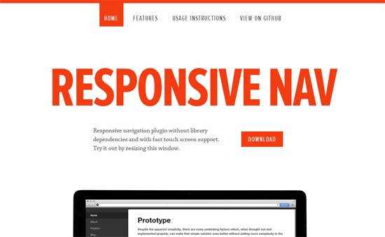
This responsive navigation menu system is lightweight — less than 1KB when optimized. Responsive Nav doesn’t have external dependencies, meaning you don’t need to include a JS library like jQuery for it to work. 2. Bootstrap Navs and Navbar
Bootstrap has two components for building responsive menus. They’re called Navs and Navbar. If you just need a responsive menu, you should customize your Bootstrap build to include only Navs- and/or Navbar-related files. 3. menu-aim
This jQuery plugin will allow you to make responsive mega-dropdown menus modeled after Amazon.com’s fast and responsive menus. This is great for sites with lots of content. Read about the genesis of this plugin at this blog post. 4. Sidr
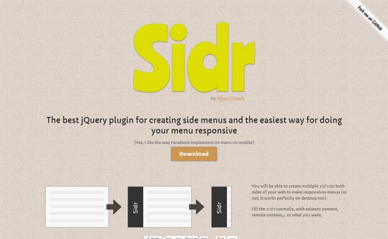
Sidr is a jQuery plugin for creating those vertical slide-out drawer menus you often see in responsive websites and mobile apps like Facebook. 5. FlexNav
FlexNav was created with a Mobile First approach. It has good browser support: For example, IE7 is supported. FlexNav is dependent on jQuery. 6. TinyNav.js
If you simply want to responsively change your HTML unordered/ordered lists to HTML dropdown menus when viewed on mobile devices, check out the first version of Responsive Nav (discussed above) called TinyNav.js. There’s also a jQuery-independent fork of TinyNav.js called SelectNav.js. 7. Pushy
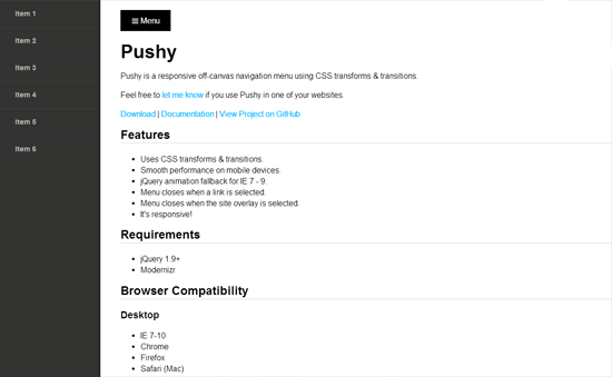
Pushy allows you to build a responsive, mobile-friendly slide-out drawer menu. It requires jQuery and Modernizr to support old browsers like IE7 to IE9. 8. SlickNav
SlickNav is a robust responsive menu navigation system that has a ton of options. It’s suitable on sites and apps with many links and subcategories. The development philosophy also emphasizes on Web accessibility: SlickNav is ARIA-compliant. Summary Table
More Responsive Navigation Menus
Related Content
About the Author
The post 8 Ways to Add a Responsive Navigation Menu on Your Site appeared first on Six Revisions. |


| You are subscribed to email updates from Six Revisions To stop receiving these emails, you may unsubscribe now. | Email delivery powered by Google |
| Google Inc., 20 West Kinzie, Chicago IL USA 60610 | |
No comments:
Post a Comment