1stwebdesigner |
| Beware: Web Design Pitfalls to Avoid Posted: 28 Feb 2014 06:00 AM PST Let's accept it. The wonderful world of web design is not a walk in the park. There are web design pitfalls to avoid. You need to create eyegasmic designs that will attract people and hook them into visiting your website frequently. However, what makes it more challenging is that web design isn't created for the eyes' pleasure only. User-experience, including how he gets the message or the gist of the whole design is a priority. The foundations of web design are deeply rooted on practicality and usability. Despite the our constant avoidance, we, web designers, are very vulnerable to pitfalls that hamper the practicality of the design. Most web designers, especially the starting ones, tend to make mistakes that could easily jeopardize the usage of their websites. Good thing, your 1stWebDesigner knows of these blunders. Let's talk about them. Poorly Placed Search BoxLooking for a tiny bit of information on the Internet is like searching for true love. It's there, but you have to know how and where to look. That is why search boxes are important.
In a world where Google equals to search, having a poorly thought search box would mean no website visitors.
Photo by YOU & I tee A search box becomes a necessity as you increase content, for most visitors look for your search box, believe it or not. They usually feel irate when they are not able to find it- and that, my friend, is very bad news. Smashing Magazine identified some problems with search box designs. In its article, Designing The Holy Search Box: Examples And Best Practices, it defined the following as frequent pitfalls:
Possible solutions:
Unreadable TextOne of the reasons why your viewers opted to look at your website instead of a printed material or a letter is they don't understand other people's handwriting. Some are very illegible. This is a crucial aspect of the whole page. The content is still the undisputed champion of the Most-Important-Section-in-the-Design league. As good as your interface is, if the viewers can't even read the content, it's still no use. Mistakes Include:
Photo from http://solvm.com Possible Solutions
Try to read Readability – Making Web Pages Easy to Read Chaos Is EverywhereContent is the life and blood of a website. Without it, it will just remain a shallow shell. The content attracts traffic to the website and allows you to monetize and share your information. This should be the driving force why you need to organize each content properly and logically. You need to pick out important points in the content of your website and highlight them so that the reader gets what you are trying to say.
photo from telegraph.co.ulk Some web designers tend to design a website for the sole purpose of eye entertainment, thus, sacrificing the content. This is highlighted when the client posts some content and ends up being confused himself. Remember the design will be put to waste if you put the content to haste. (that is a pretty good rhyme, isn't it?) This means that the use of bullets, headings, subheadings and other organizational symbols and elements is advisable. This will avoid confusion and inaccuracy with the content. Jordan Dick of venturi-web-design.com said it best,
In his article, Organizing Website Content, Jordan pointed out the following points:
To put it in Jordan's analogy, it's like looking at a restaurant menu where there are a lot of food items to order. All of the contents of the menu are grouped whether they are for dinner, breakfast or snack. The groups are then further divided to pastas, chicken, vegan, pork and dessert. Poor NavigationLet's say that the website is a tourist destination, a 1000-year old labyrinth perhaps, and you want to explore it to see its true beauty. Will you do it without a map? Navigation is one of the most important parts of the web design. It should be unbroken. Your web visitors should be able to find where they are and where will they go in your web design. Remember that the main purpose of the navigation is to act like a map and to direct and redirect the user to a particular page in the website. With it being messed up, the viewer might feel lost and opt for another link instead. Here are the things you need to avoid:
Photo from dafacto.com Possible Solutions:
Horizontal ScrollingToday's web design trends look at horizontal scrolling as an abomination. With the invention of the scroll wheel in our mouse, it has definitely solved the growing problem of vertical scrolling. However, the horizontal scrolling problem wasn’t solved- it was demolished. Web designers should do away with this also. For developers, fit it to 1024 x 768 px. Photo from Everyinteraction.com Putting a Displeasing Amount of ImagesThe time when there are almost 50 GIF images in a single webpage is over. Modern web design trends discourage the use of too many images. It irritates and distracts the viewer from the main content. Plus, it adds a little bit of memory in the page that you load each time a visitor views your website; images make it slower to load. Possible solution:
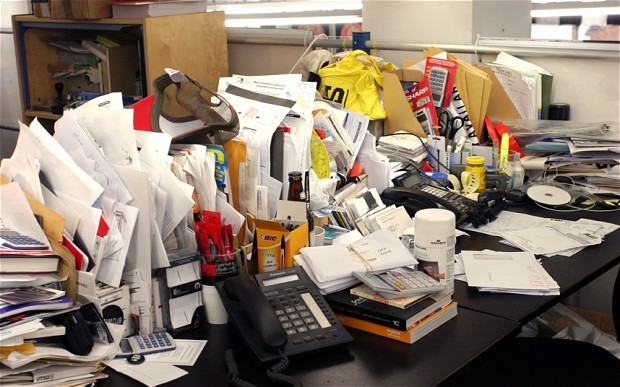
Photo from Jade Too Much Website ClutterThere are times where you just feel like you are strangled by the content. Images are placed closely to the point where you feel claustrophobic. That just means that the web designer hasn’t heard of the white space yet. White space allows the content to breathe. (Not literally, of course.) It gives the eyes some sense of relaxation and suggests cleanliness and organization of design. So you need to add spacing to your texts, images and other website content.
photo by experiencing dyanamics ConclusionThe aforementioned pitfalls are very subtle and yet dangerous to fall into. It will hamper the quality of your work. Learning what these pitfalls are is just the first step. You have to apply them in your design. Yes, it will be very difficult and arduous; it takes a lot of time, but it will make you a better designer. You’ll be surprised with the results as you progress. Learn to kill these bad habits and you’ll realize that your income, your design and your view of self will totally change! |


| You are subscribed to email updates from 1stwebdesigner To stop receiving these emails, you may unsubscribe now. | Email delivery powered by Google |
| Google Inc., 20 West Kinzie, Chicago IL USA 60610 | |
No comments:
Post a Comment