1stwebdesigner |
| Simple Yet Important Cross-Browser Styling Tips Everyone Should Know Posted: 27 Jan 2014 06:00 AM PST Many have been searching for cross-browser styling tips that can help them solve their browser compatibility problems. After all, creating a website can be easy but developing one that looks the same on all browsers can be tough. For many years, browser compatibility is one of the hardest parts of web development.
As a web designer/developer, it's always our goal to give our website visitors better experience on viewing our site. Having a consistent look on every browser leaves a visitor good impression of the site. If you’ve been developing websites for a long time you might agree with me that IE8 and the Jurassic lower versions of IE are the one of the web designer’s and developer’s nightmare. Given this fact that, there are still people using these versions of IE to view websites. This is just one of the issues that we might encounter in developing a cross-browser website. The good thing is that we can redesign a site or initiate some good practices to make them compatible and look the same on every browser. In this article, I will show you some cross-browser styling tips and tricks to make your website development easier. Use CSS ResetLet’s face the fact that web browsers interpret different default styling for HTML elements. Some browsers have different interpretations towards values for styles like margin and padding. To fix this issue, adding a CSS reset at the start of your style sheet is a good practice. This will reset all CSS elements. This would also mean that it will start from a zero base, thus, giving you complete control to your style sheet without worrying about the browser’s CSS issues such as margin, padding and alignment. Eric Meyer has a good set of CSS rules to do this. You might also want to consider Nicolas Gallagher’s Normalize.css, a modern HTML5 ready alternative to CSS resets. After you’ve linked the CSS rules to your markup, you can now make sure that you have a starting zero base CSS on every browser. Validate Your HTML and CSSBefore running or publishing your website, it's a good practice if you validate both your HTML and CSS using validators as it will correct some minor errors that might give you some problems in the future. You can use W3C HTML Validator and CSS Validator. These are trusted validators by W3C but feel free to use your own tools if you have another resource of HTML and CSS Validator that works for you. IE Conditional CommentsThe Jurassic versions of IE had been giving web designers and developers a headache when it comes to compatibility issues. As an answer to this issue, Microsoft developed conditional comments in their browser that allows linking a style sheet that will be interpreted by IE alone. Check out the code below. The code below will target all versions of IE. ! <--[if IE]> <link href="ie.css" rel="stylesheet" type="text/css" /!> <[endif]--> The code below will target a specific version of IE. ! <--[if IE6]> <link href="ie.css" rel="stylesheet" type="text/css" /!> <[endif]--> Use Vendor PrefixesW3C standards are continually evolving. It’s good practice that you know certain drawbacks if a browser supports a particular CSS property. Styles like rounded corners, drop shadows and gradients can now be implemented using CSS alone without the use of images. Using vendor prefixes will save you a lot of time without worrying if the browser supports your CSS. Check out the following list of vendor prefixes. 1. Safari and Chrome (-webkit-) As an example, let us use the transition property along with vendor prefixes to target specific browsers. -webkit-transition: all 4s ease; -moz-transition: all 4s ease; -ms-transition: all 4s ease; -o-transition: all 4s ease; transition: all 4s ease; Clear Your FloatsWe all know how to float elements either to the left or right by using the style property float. By default, if you only just use onefloat along with a non-floated element, it will just flow along the side of the element you floated. But that is not the issue here; most often we float divs to the left and right and wraps them with a container or wrapper. Consider the images below. 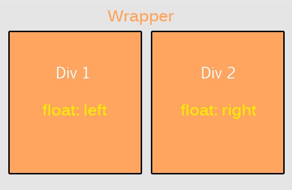 This image shows what we are trying to achieve. 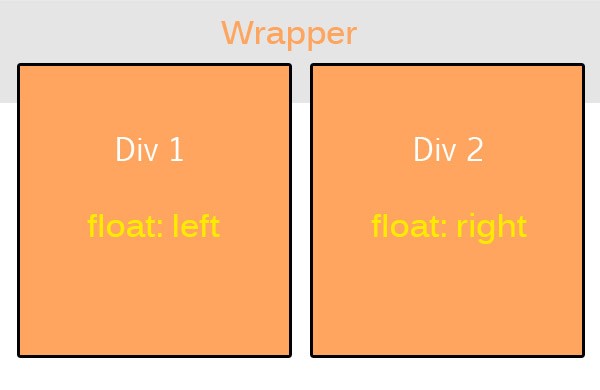 But instead our divs end up like this image. This issue can be solved by simply clearing the float using the CSS property clear and adding a value of both. That means both floats will be clear. Font Size MeasurementAlthough there are no fixed thumb rules what font size measurement to use, I would recommend using ems (em) and percentages (%) since ems and percentages are based on the default preference set in the user’s browser. Most people use pixels or points, which are measurements based on the resolution of the screen. This is always fixed. Regardless your preference, this How to Size Text in CSS article would help you learn more about text in CSS. Always Test Your Website Using Different BrowsersYou might feel lazy testing your website in different browsers, thinking that it looks good in the modern browsers, believe me, I’ve been there but not doing it might give your website visitors a bad experience. Using an emulator like spoon plugin might save you some time but it is highly recommended if you test your creation directly on the actual browser itself. Code SimplyCoding simply makes the whole workflow easier and faster. What do I mean? Just by using simple elements in building up your website makes the browser’s task a lot easier to read your site. As an example, instead of using tables or paragraphs in creating navigation you might just use an unordered list to form the navigation. In creating a responsive site, instead of using tables, divs works perfectly. Keep it simple, organize your codes and name them properly. Believe me, this will save you a lot of time and headache when you run into some problems. Polishing OffThere are more good tips and tricks out there about cross browser compatibility but this should guide you on the basic foundation in creating a firm cross-browser experience. It’s a good idea taking some time to read your codes and check them across different browsers. If you know some more tricks and tips that we’ve not listed here or you have some comments or suggestions, I would love to hear from you. Please free to drop them in the comment section below.     |
| You are subscribed to email updates from 1stwebdesigner To stop receiving these emails, you may unsubscribe now. | Email delivery powered by Google |
| Google Inc., 20 West Kinzie, Chicago IL USA 60610 | |


